LINE AS TEXT
ARTS 210 – GRAPHIC DESIGN I
BINGHAMTON UNIVERSITY (SUNY)
HARPUR COLLEGE OF ARTS AND SCIENCES
Assignment instructions:
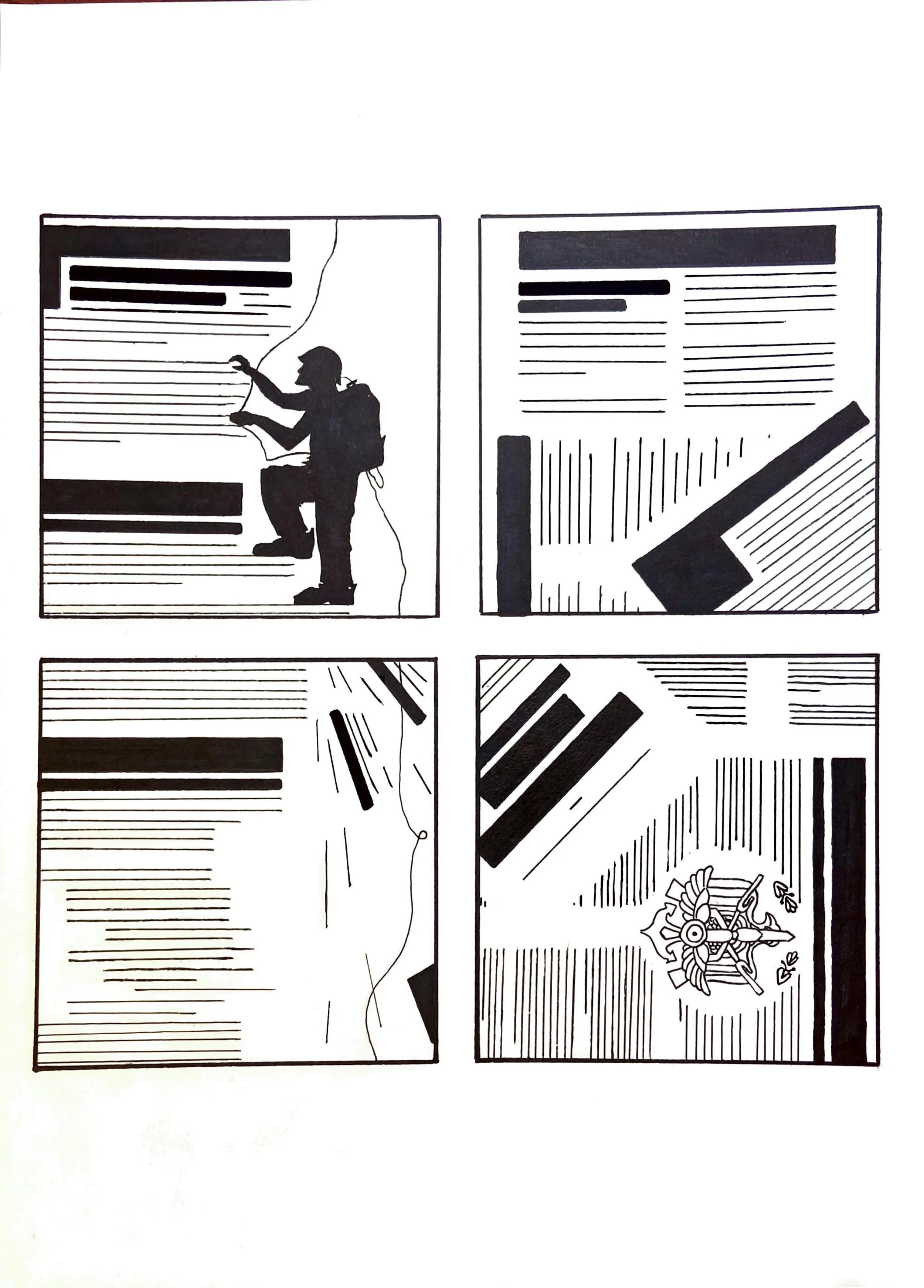
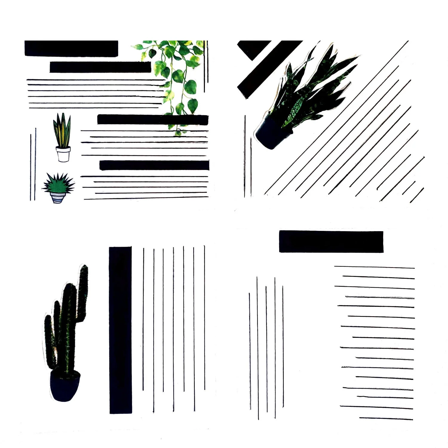
From the distance any text could be perceived as multiple lines of various thicknesses, length, intensity spacing and position. Using just 3 simple kinds of lines instead of text create interesting visual hierarchy in each square by designing several blocks with three major sections inside as following:
Head (main title): the most important part of text usually presented with large type; in our project should be represented with just one thick black line.
Subhead: the second most important part of text usually presented with type smaller then one used for headline but clearly larger then the rest of the text (text copy); in our project this should be represented with one or two black lines thinner then one used for the head and thicker then one used for the rest of the text.
Body copy: the least important but the largest part of any text; in our project should be represented with several (6-20) black lines thinner then those used for the subheads and heads.
Assignment requirements:
Horizontal lines
Vertical lines
Angled lines (30°, 45°, 60°, or 75°)
Incorporate image(s) in 2 of your compositions
3 different line thicknesses representing respectively main title, secondary title(s), and text body(ies).