Hello👋 I am a Greek-born graphic designer based in Triploli, GR, Athens, GR, DeKalb, IL, Chicago, IL, Basel, CH, Chicago, IL, Normal, IL, Binghamton, NY. I create visual essays and installations. I also work with brand identity, and make books, posters, catalogs, brochures and other printed matter. Sometimes I make websites, videos, gifs, furniture, music … and some other things✌️.
Email: alexandrosskouras11@gmail.com / askouras@binghamton.edu
↓ Below you will find a selection of works created between 2017-2023
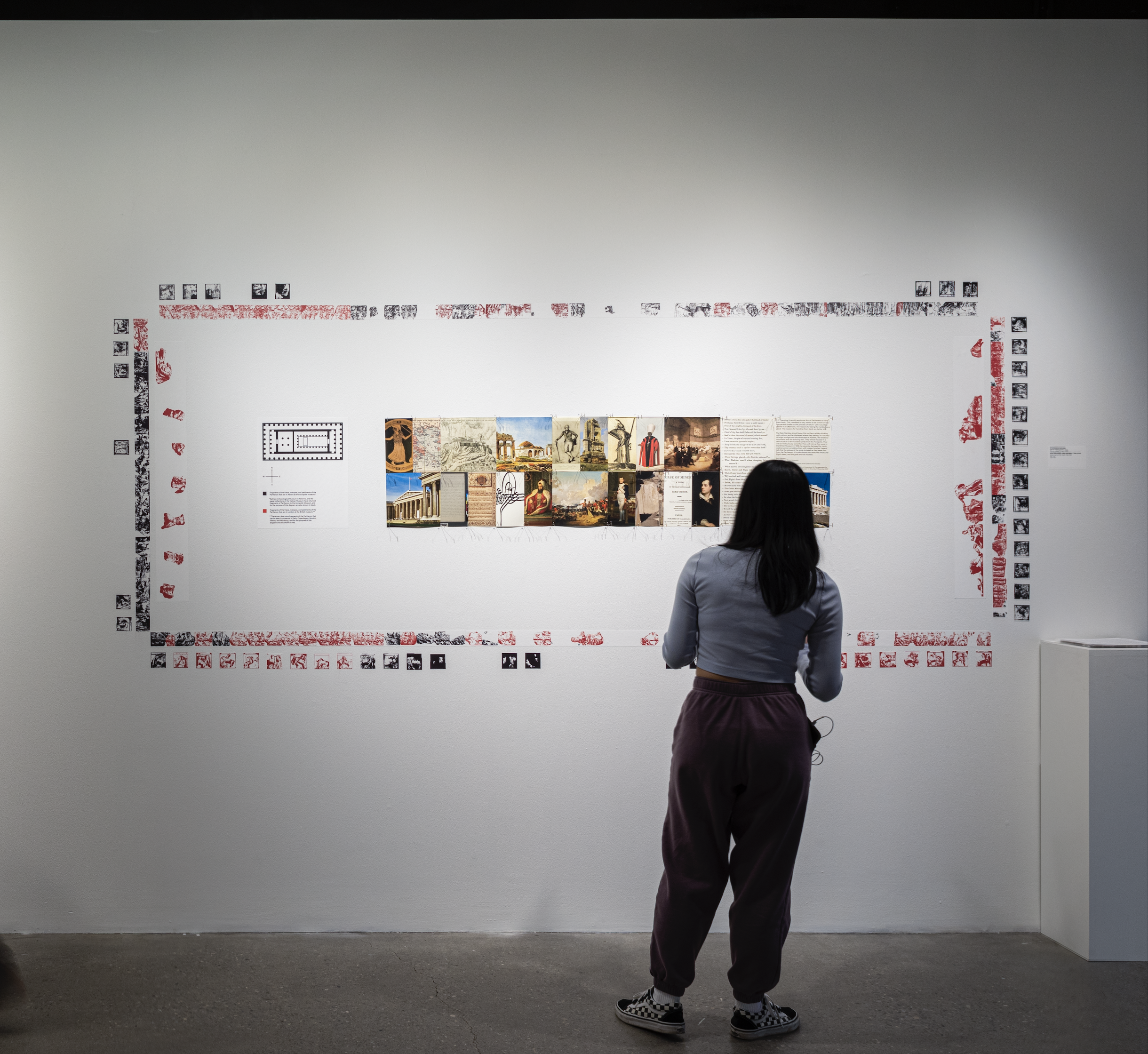
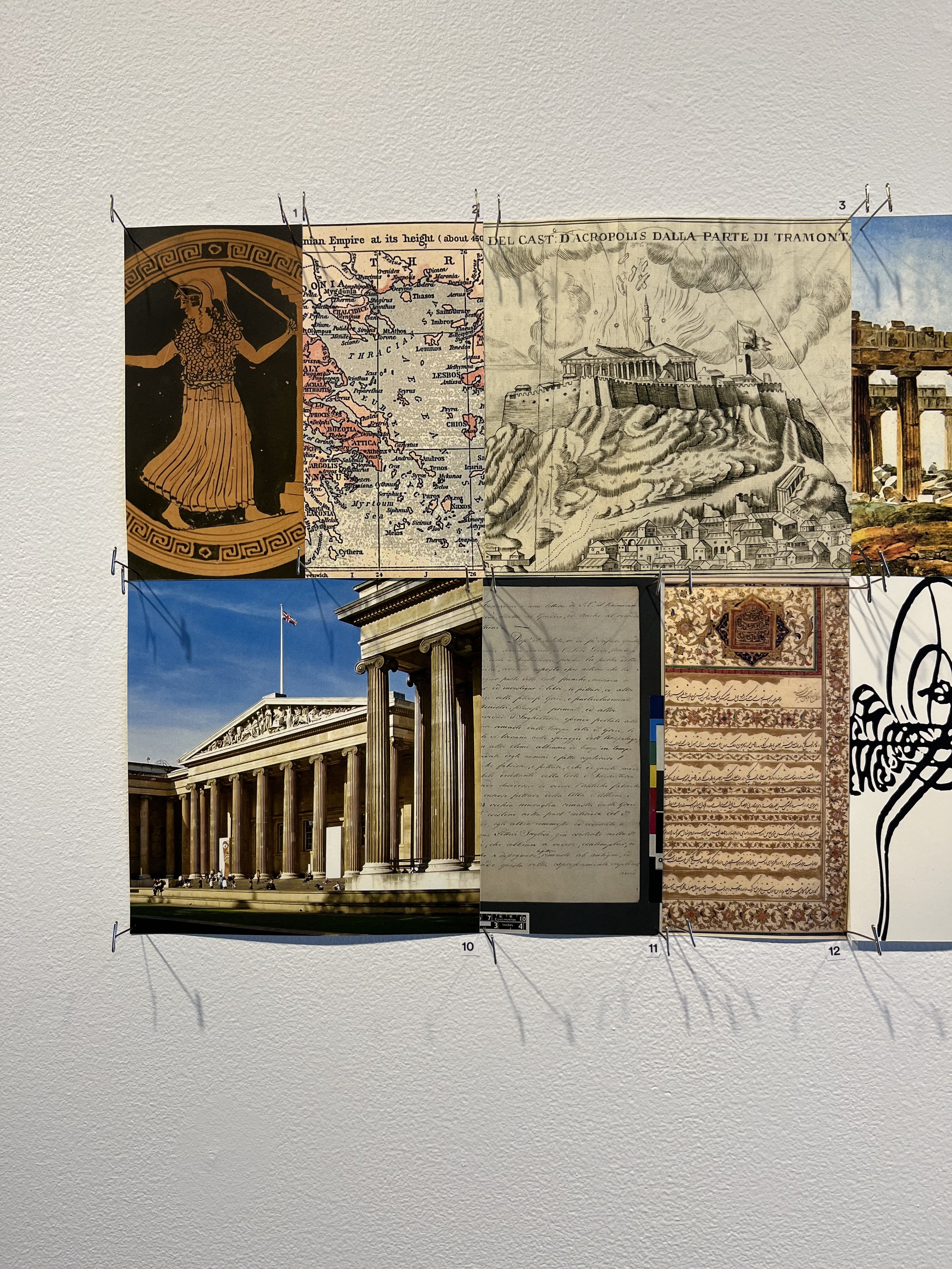
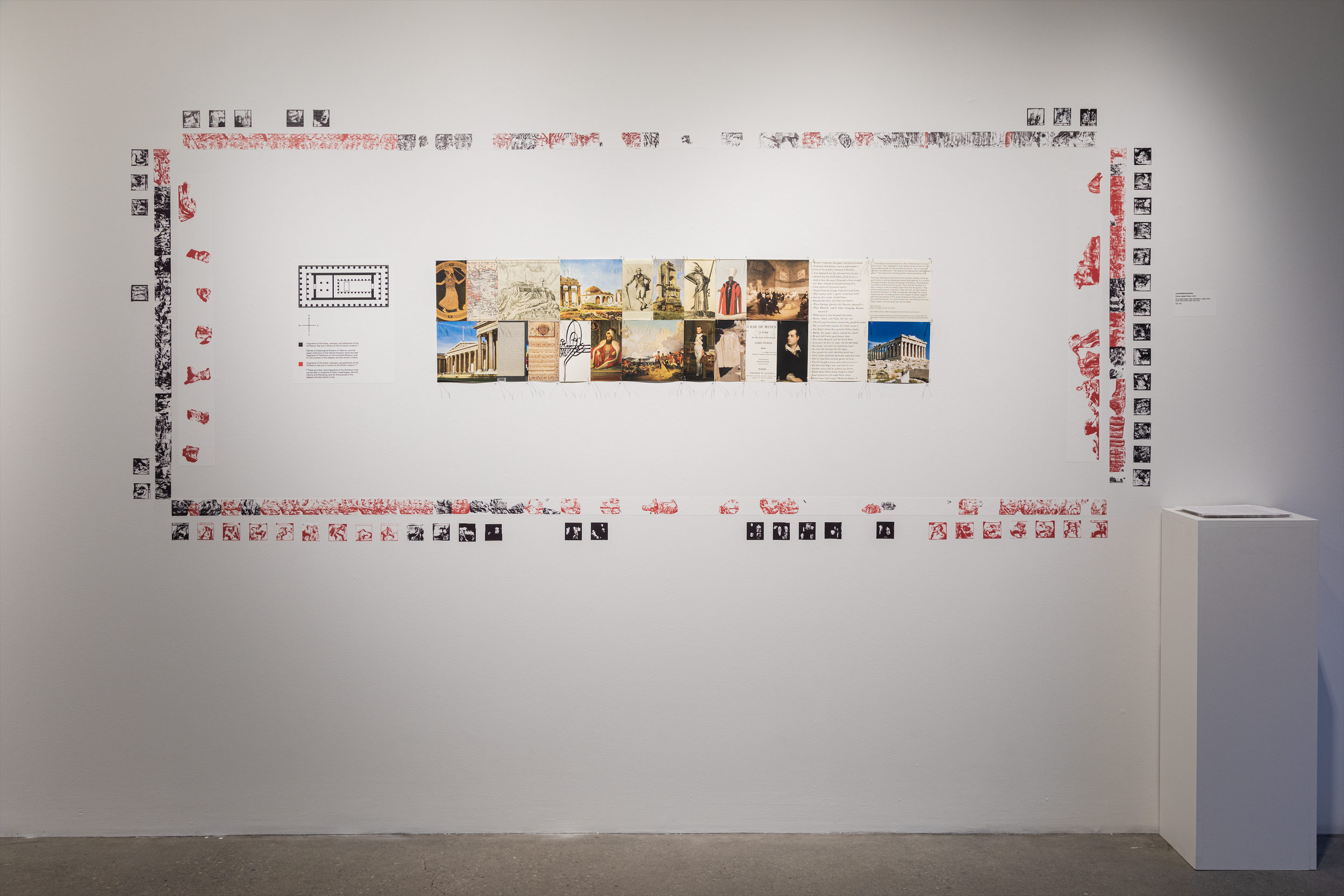
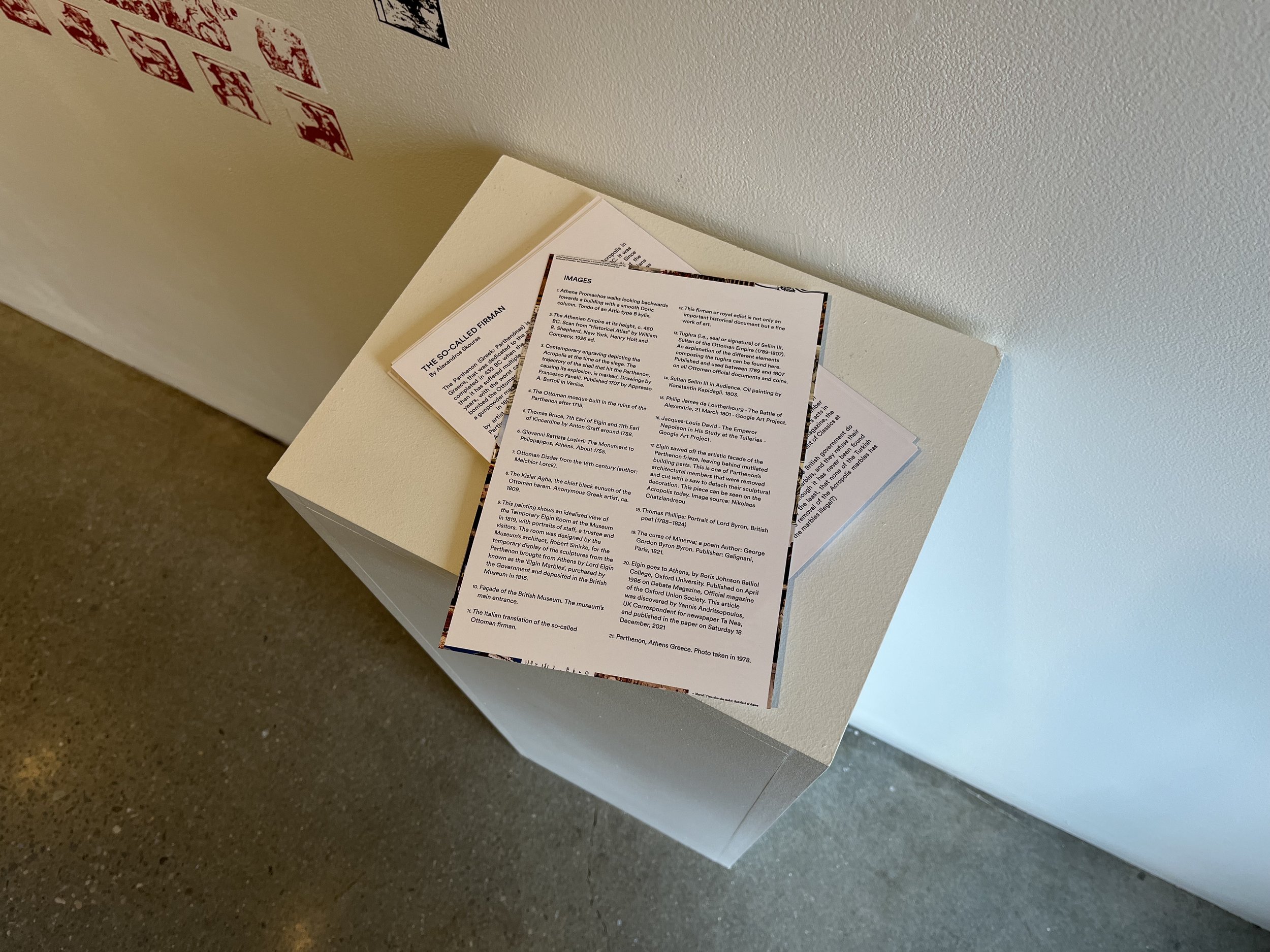
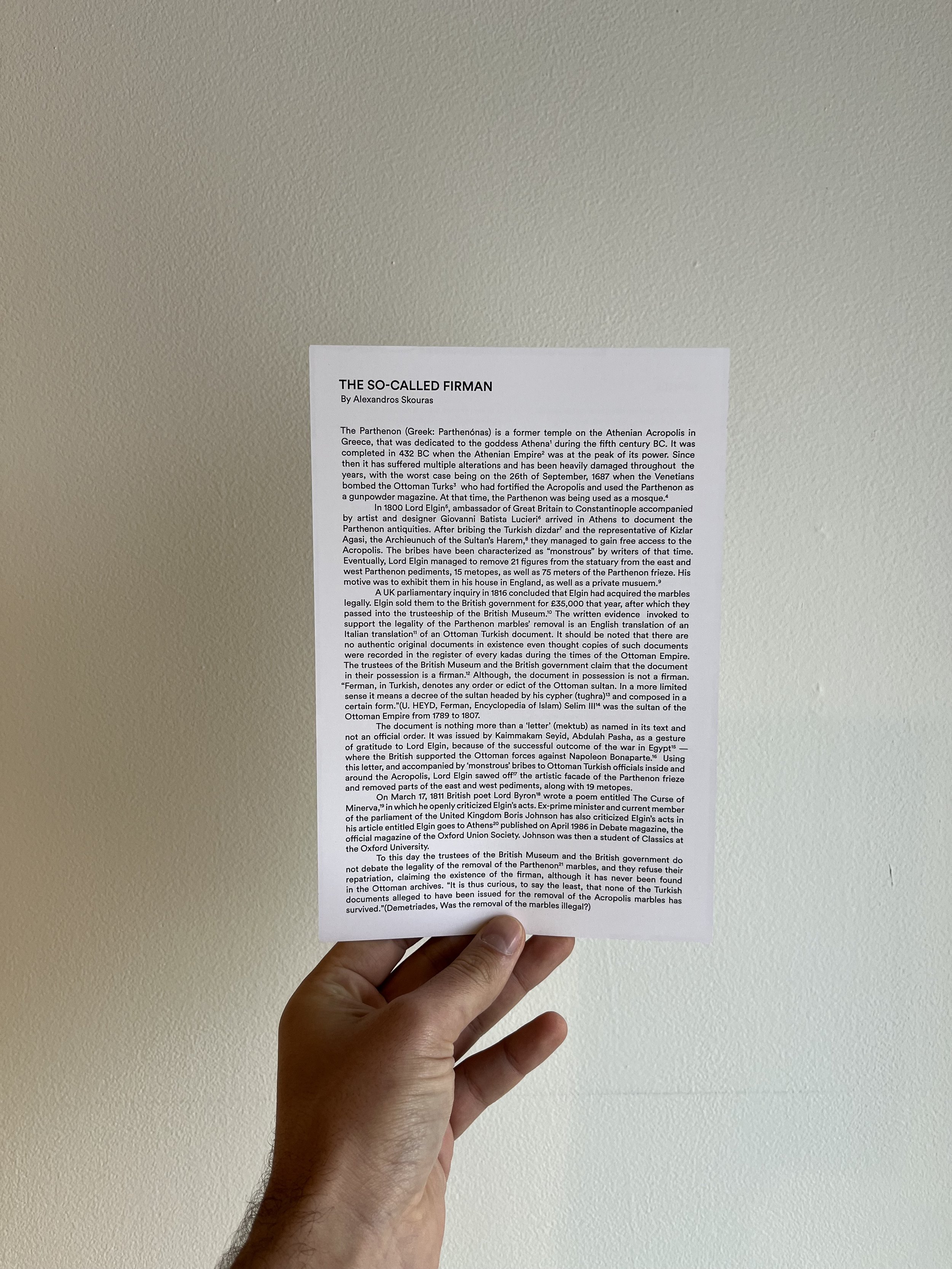
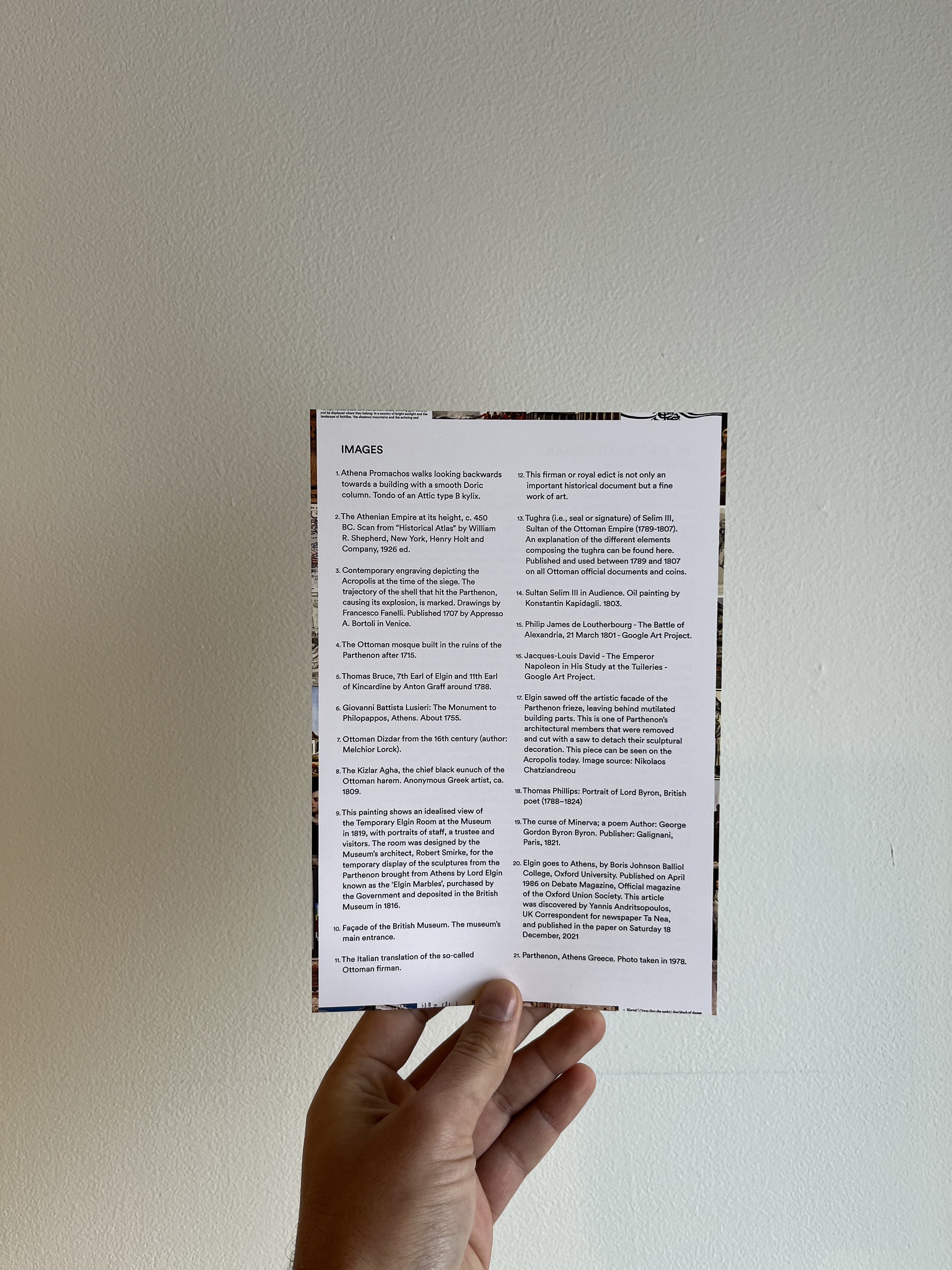
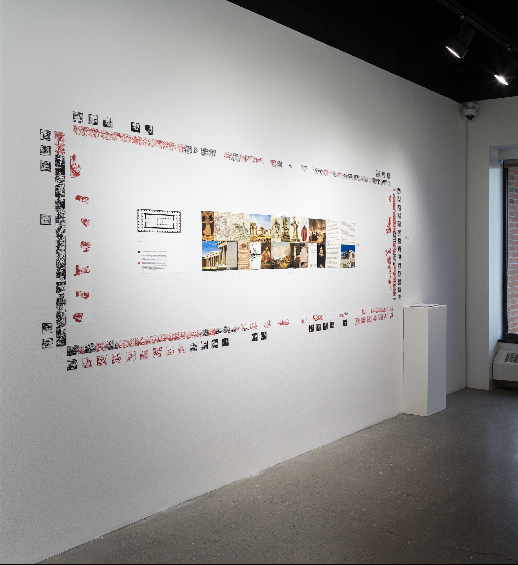
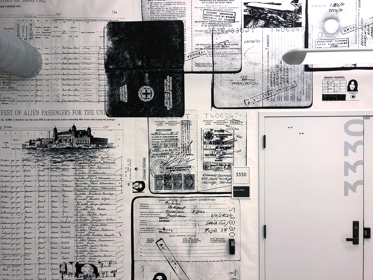
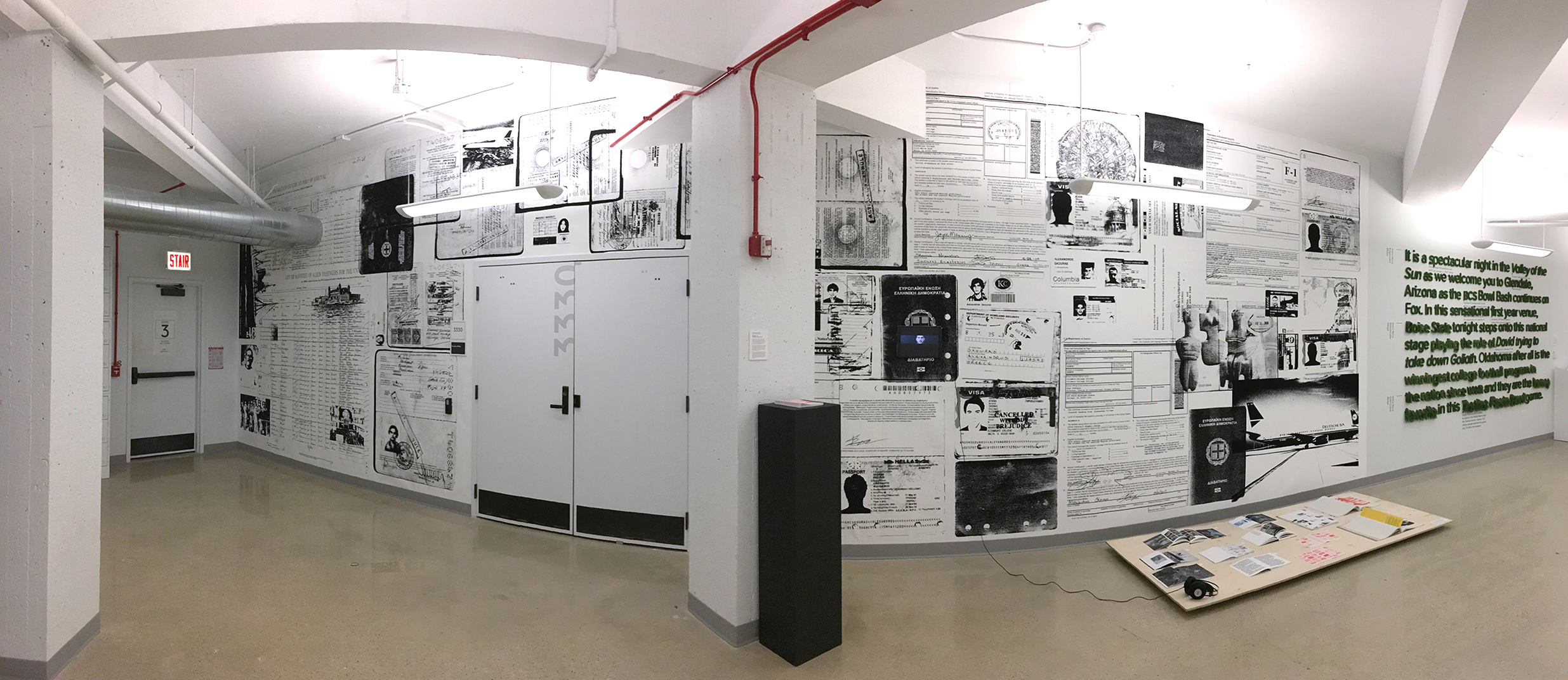
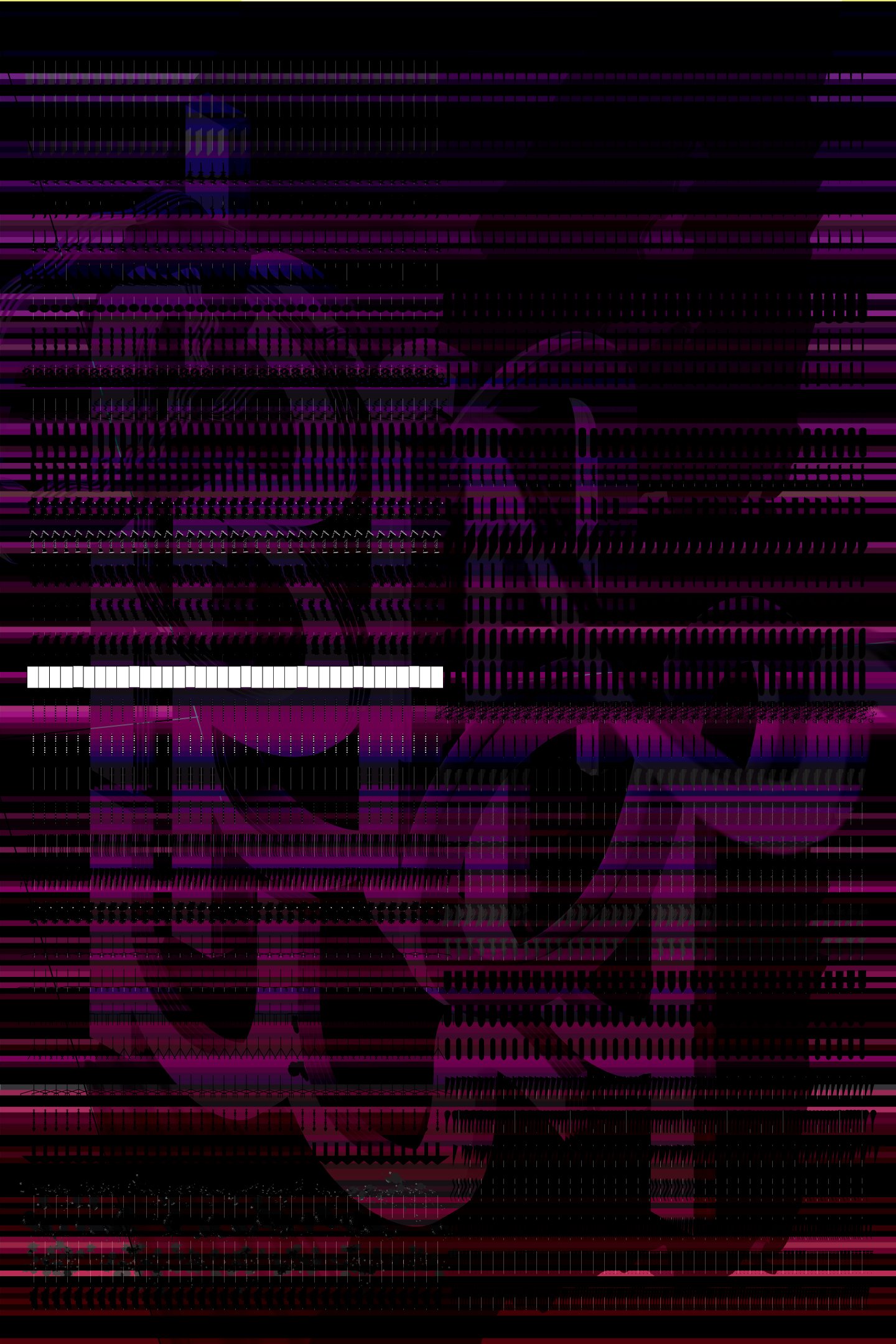
The so-called Firman, 2023
Print assemblage / Wall installation. Laser prints, photo-text prints, black vinyl, text
100 × 50 inches
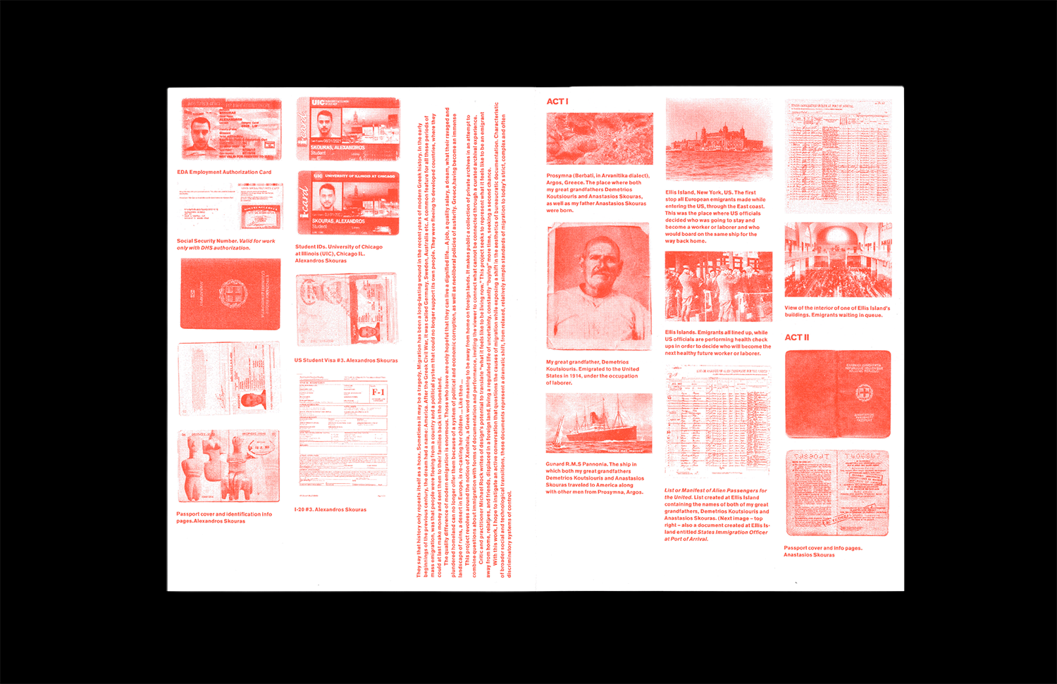
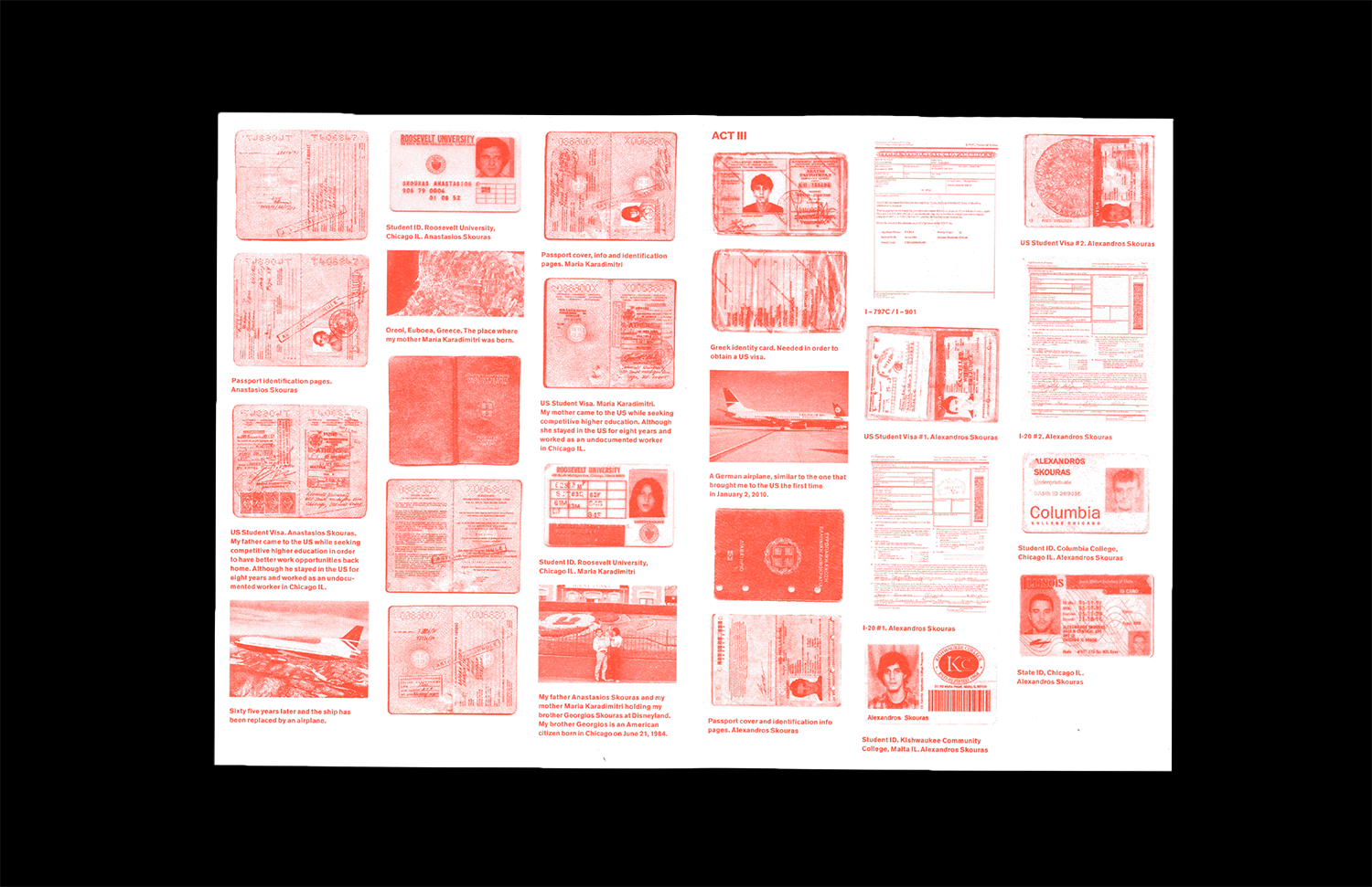
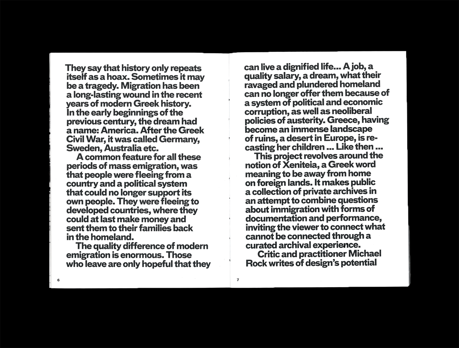
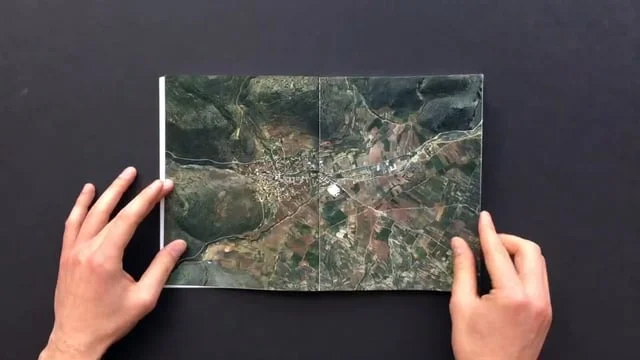
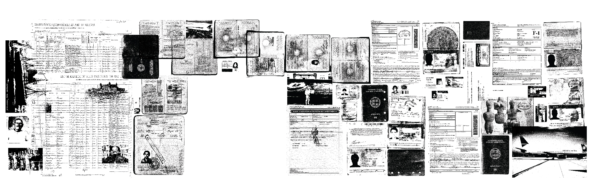
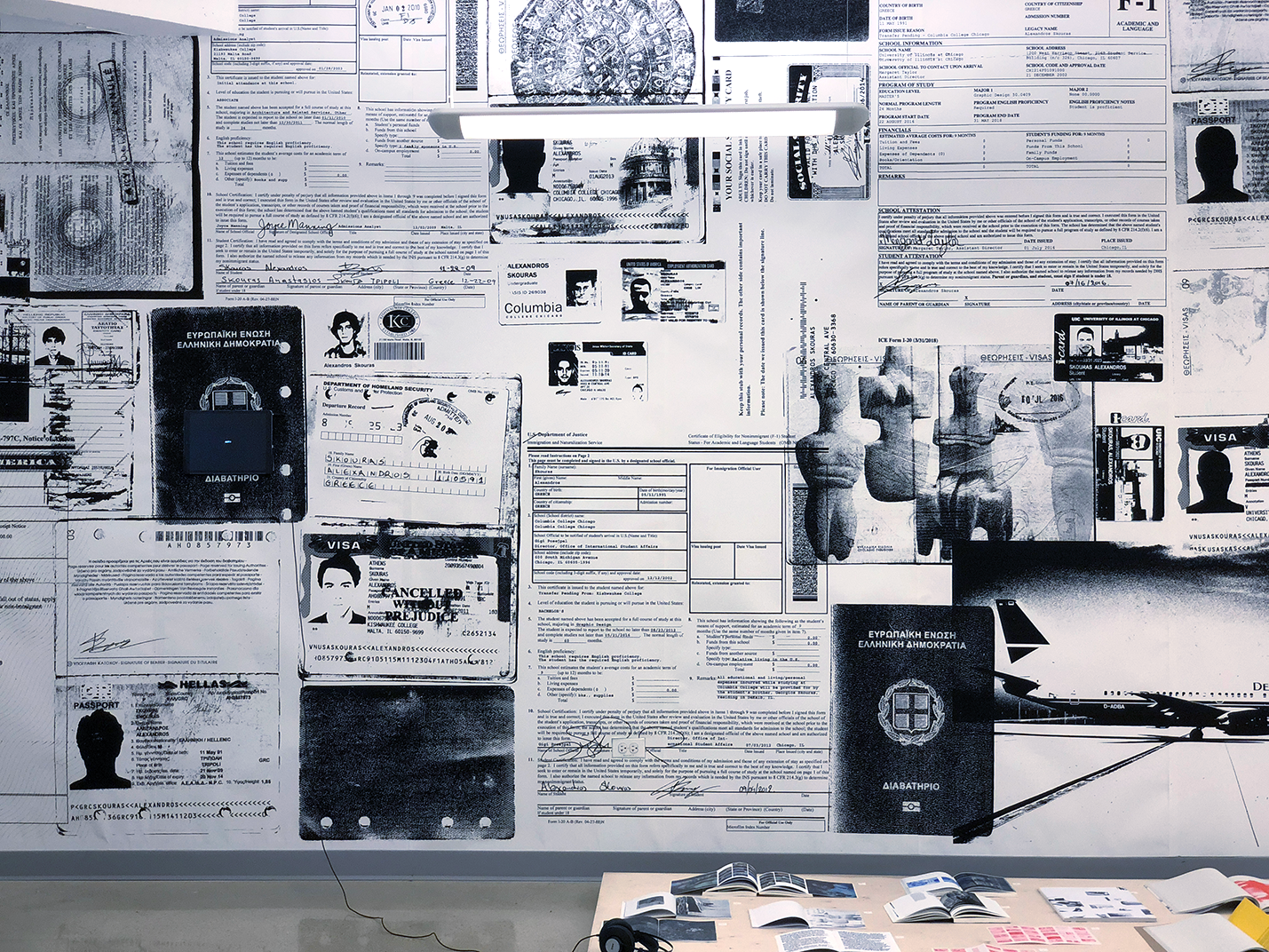
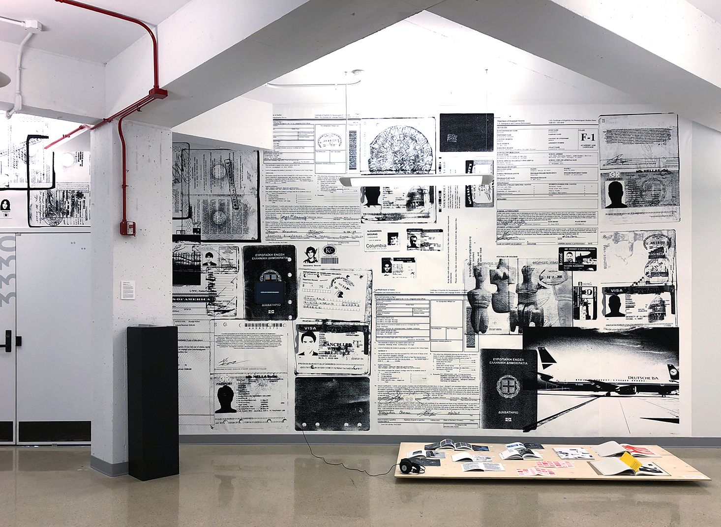
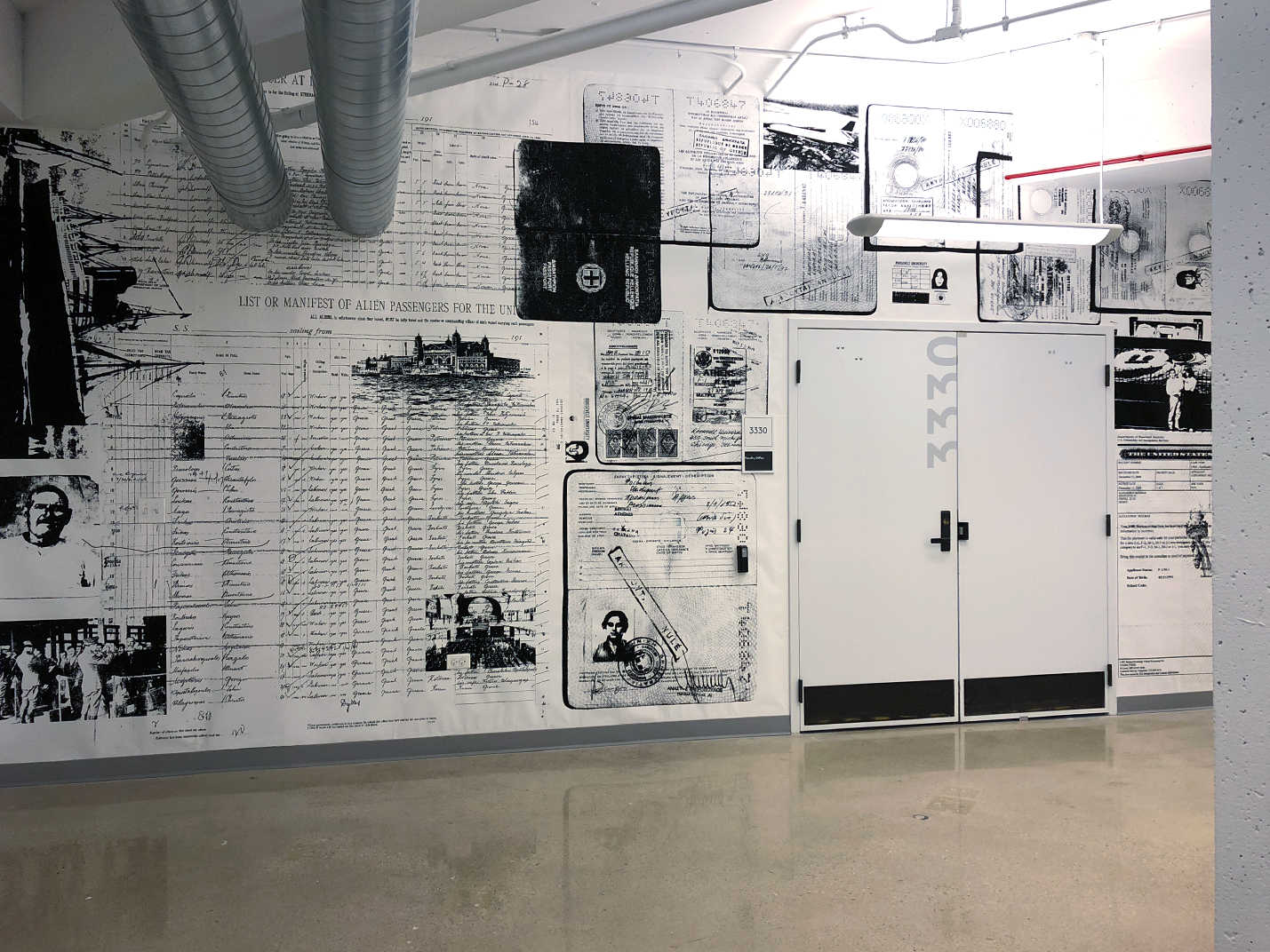
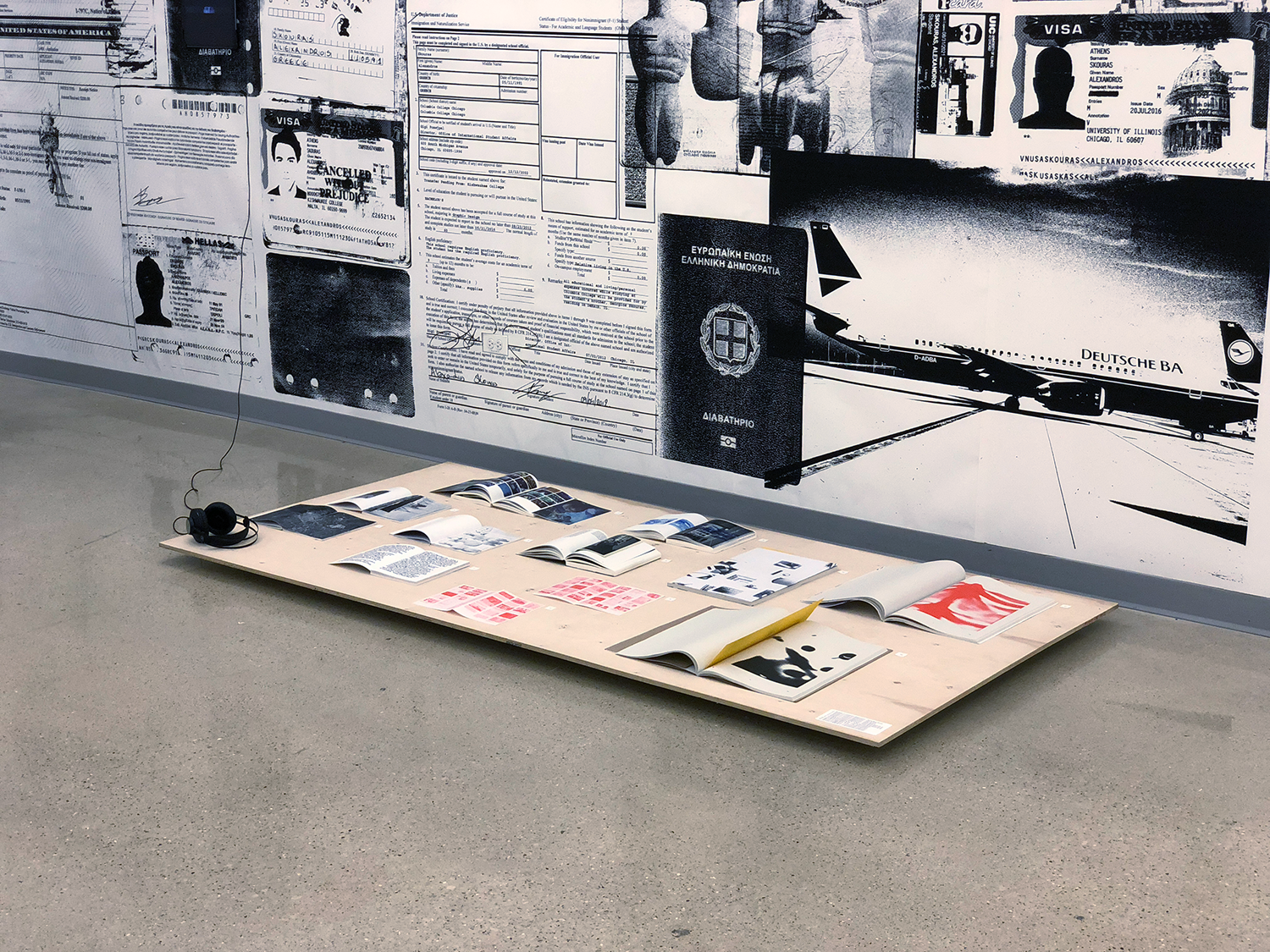
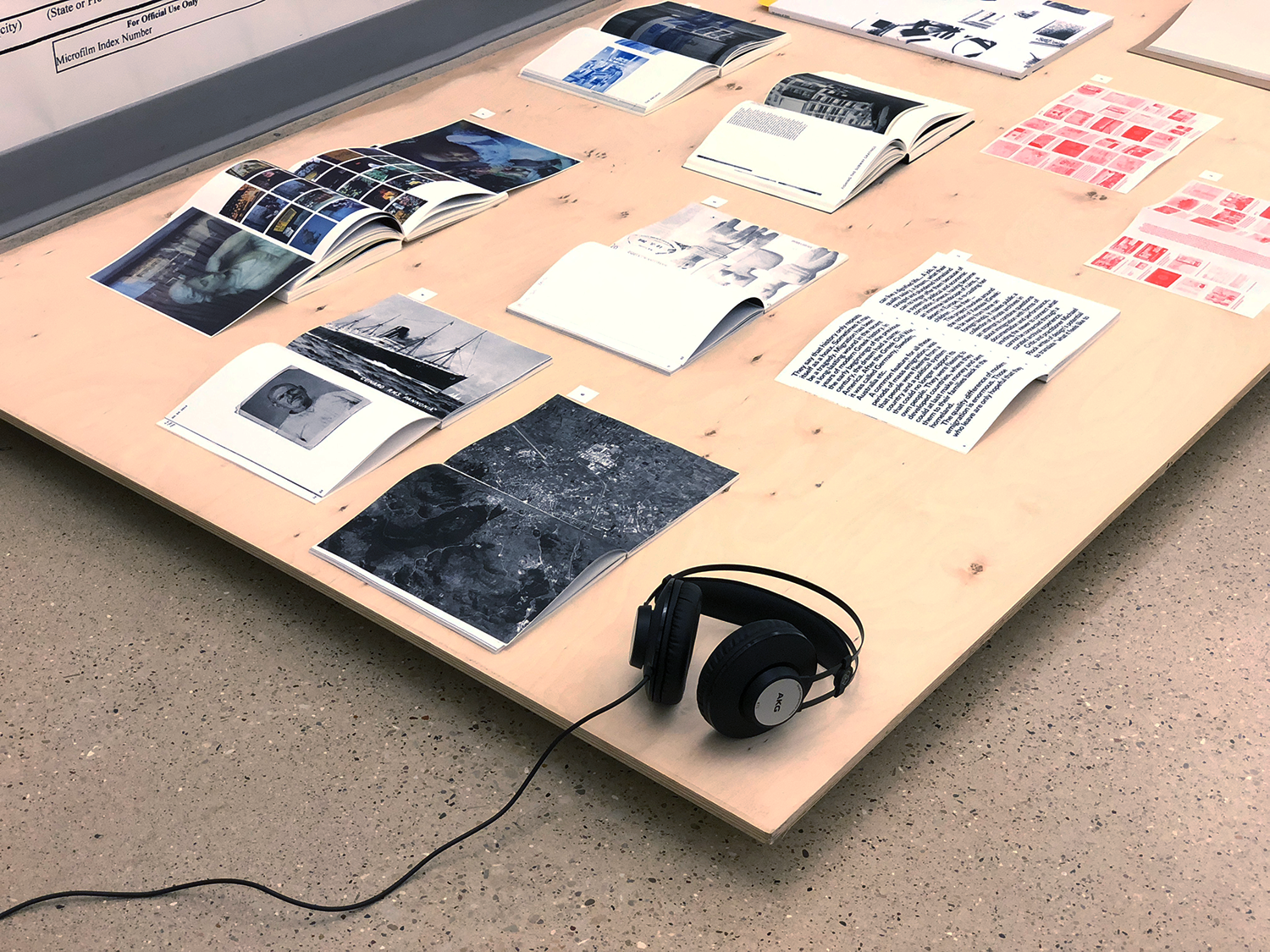
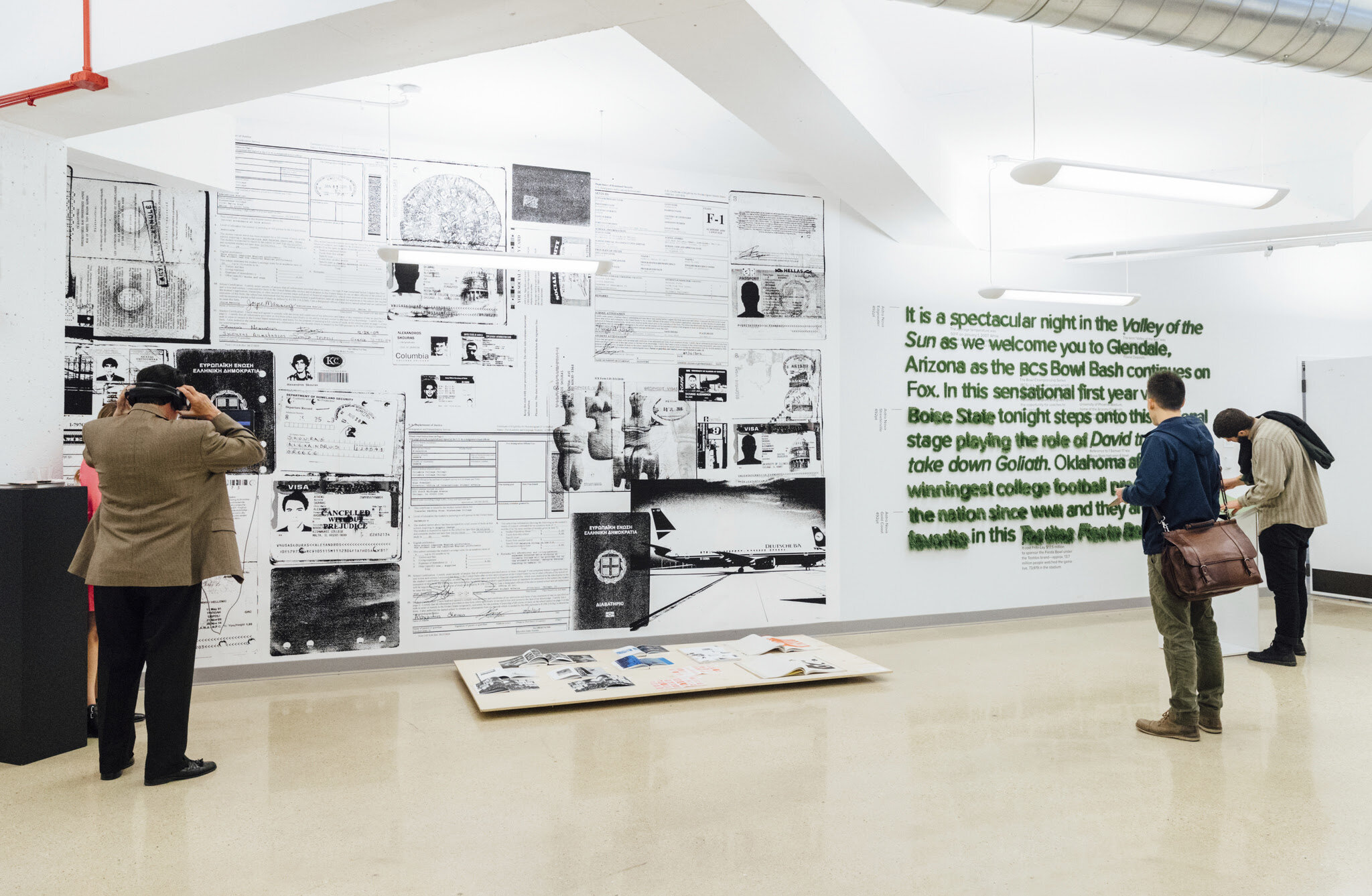
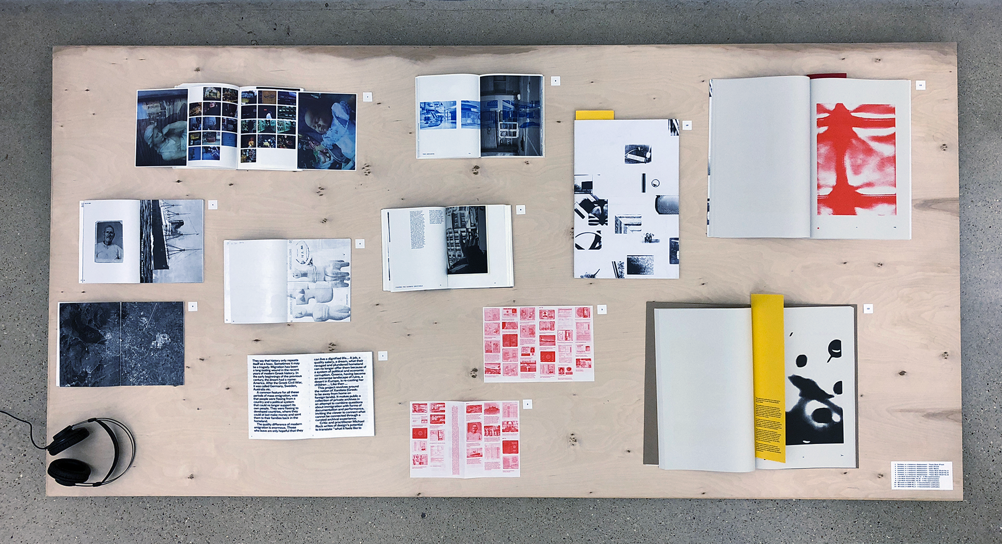
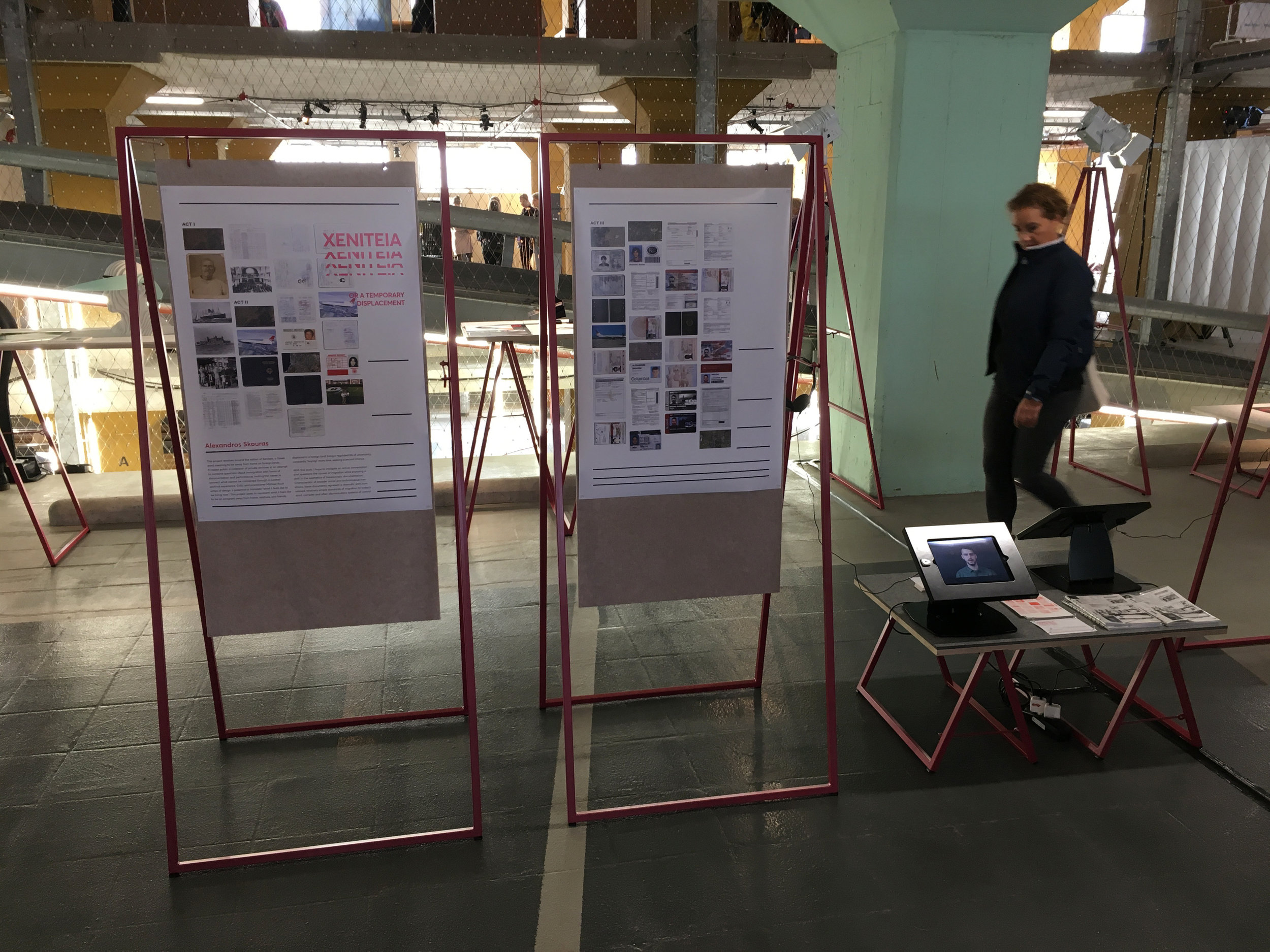
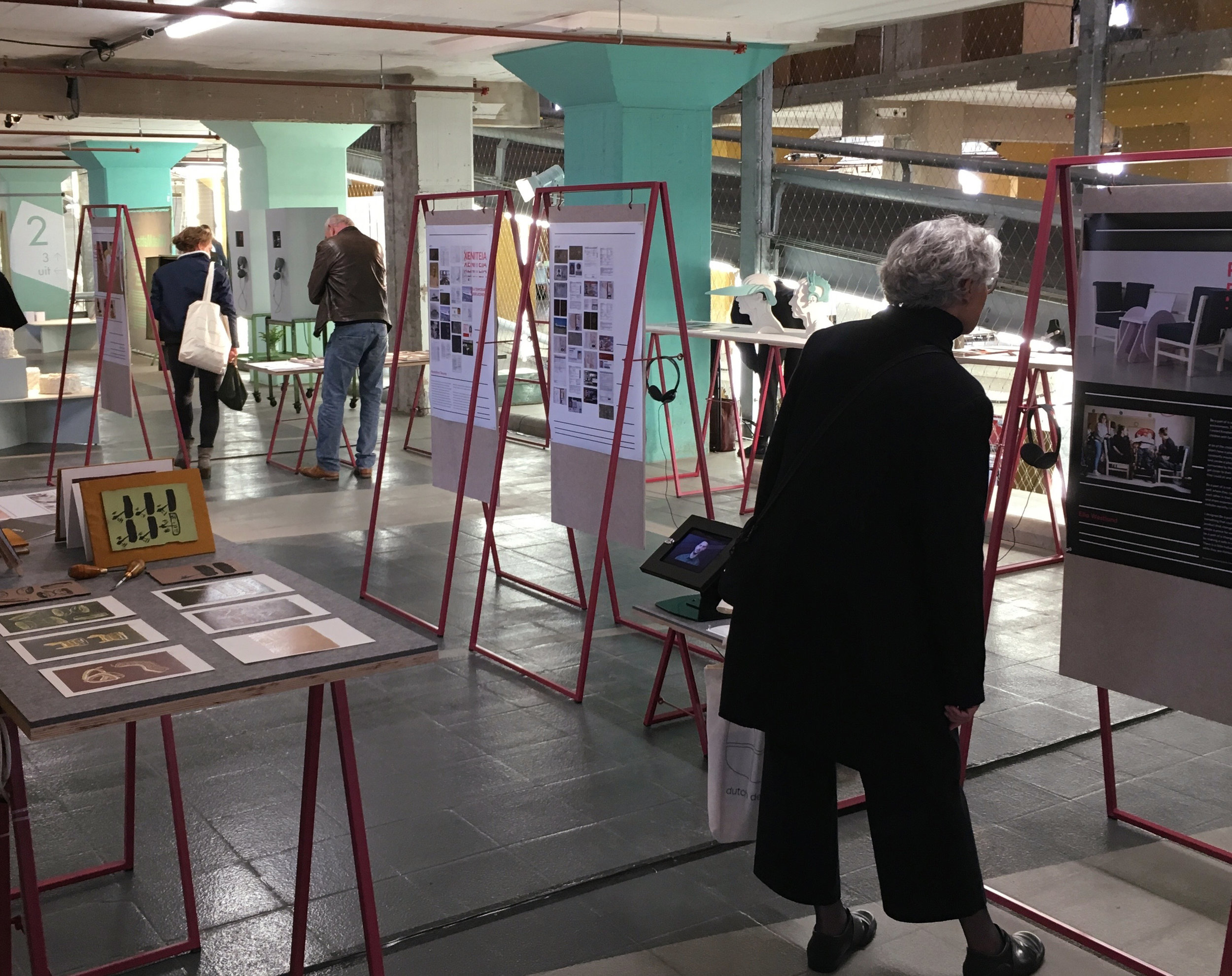
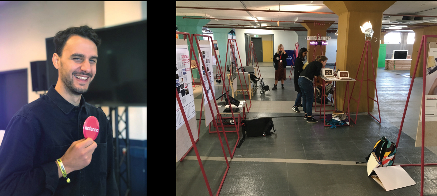
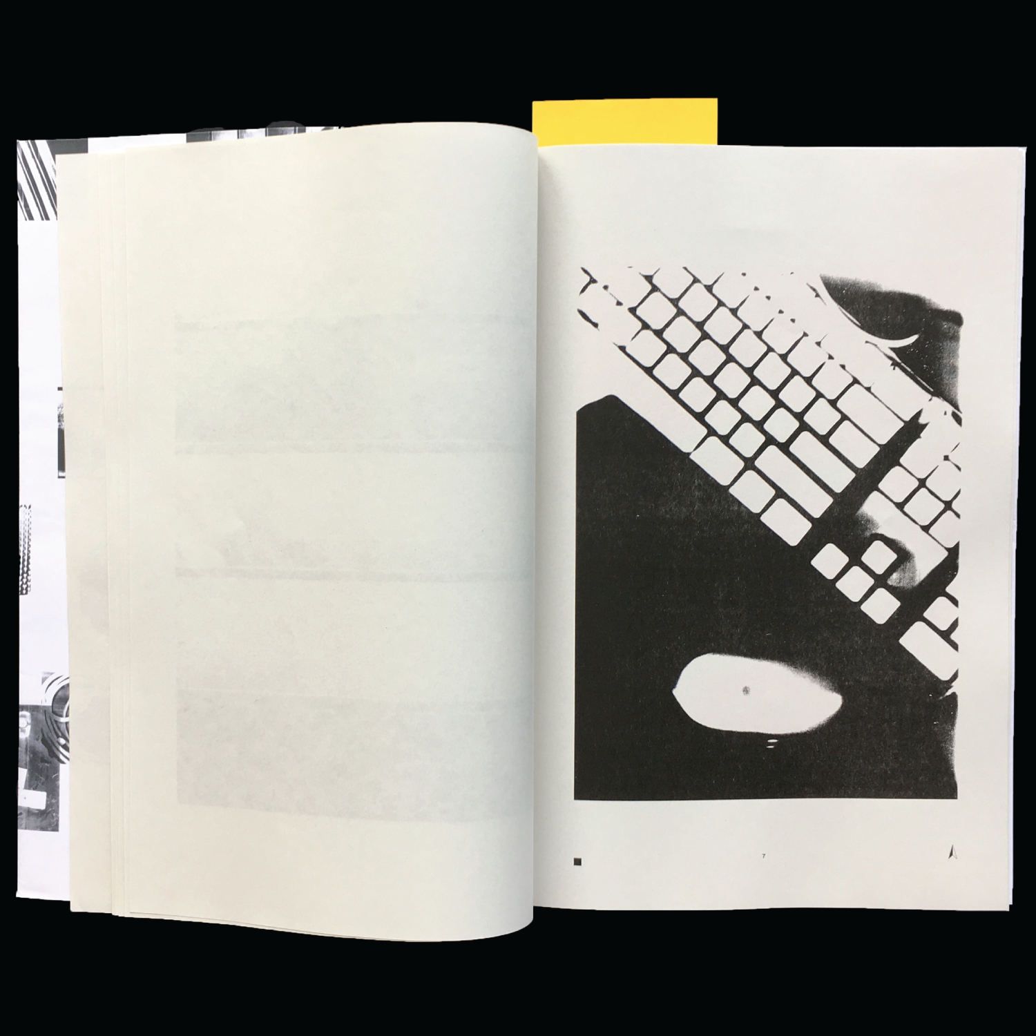
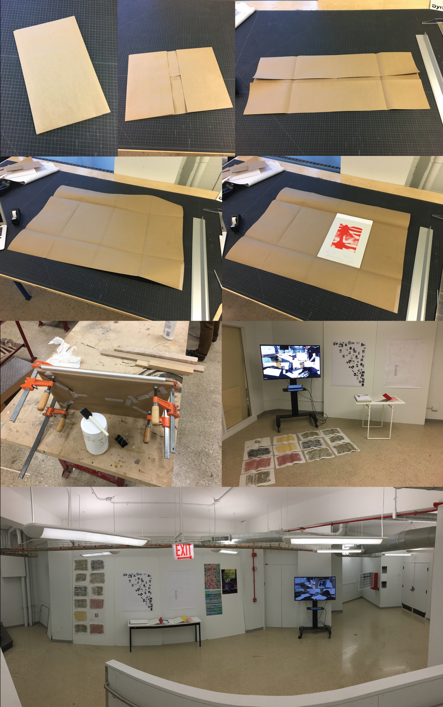
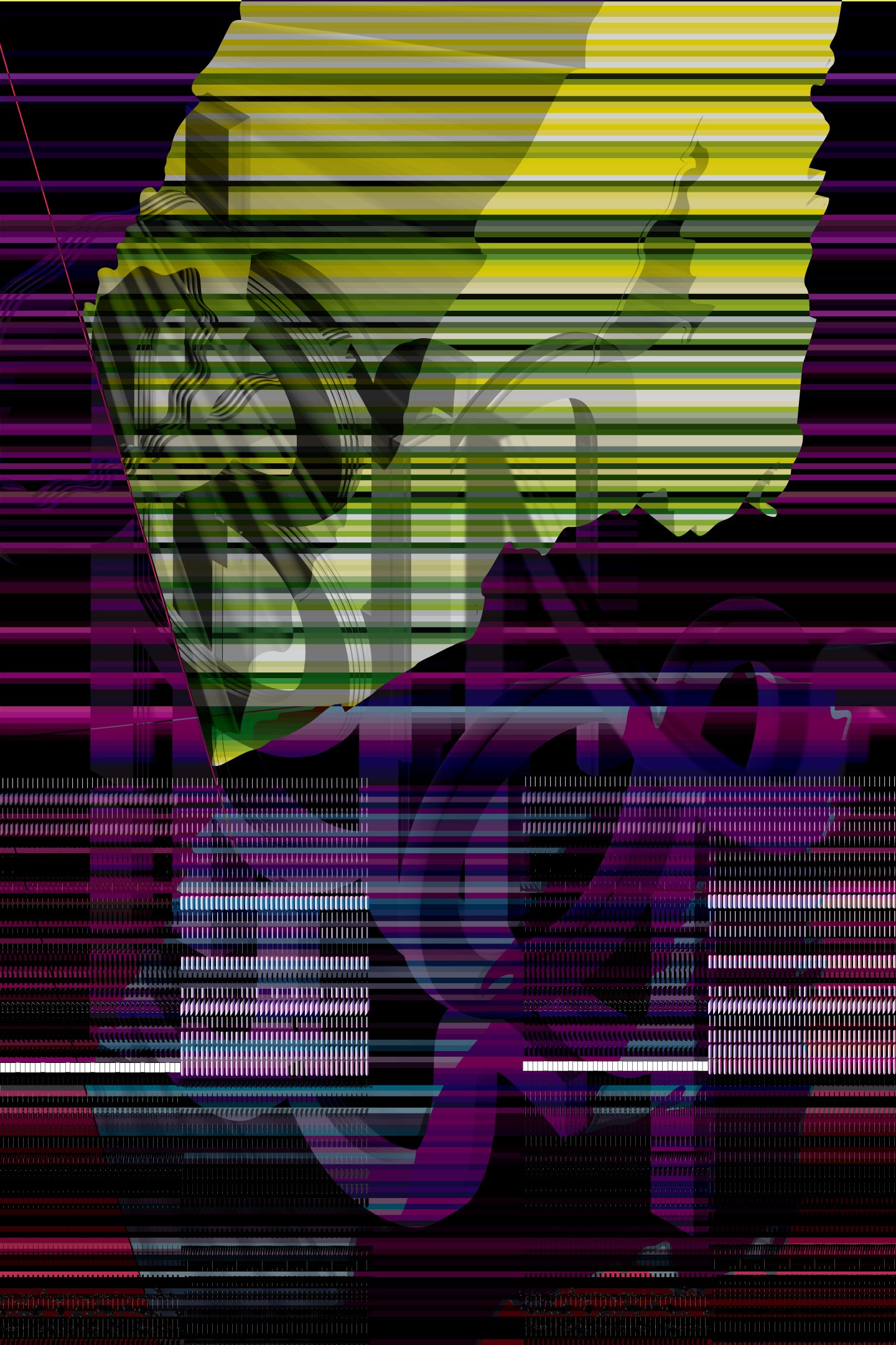
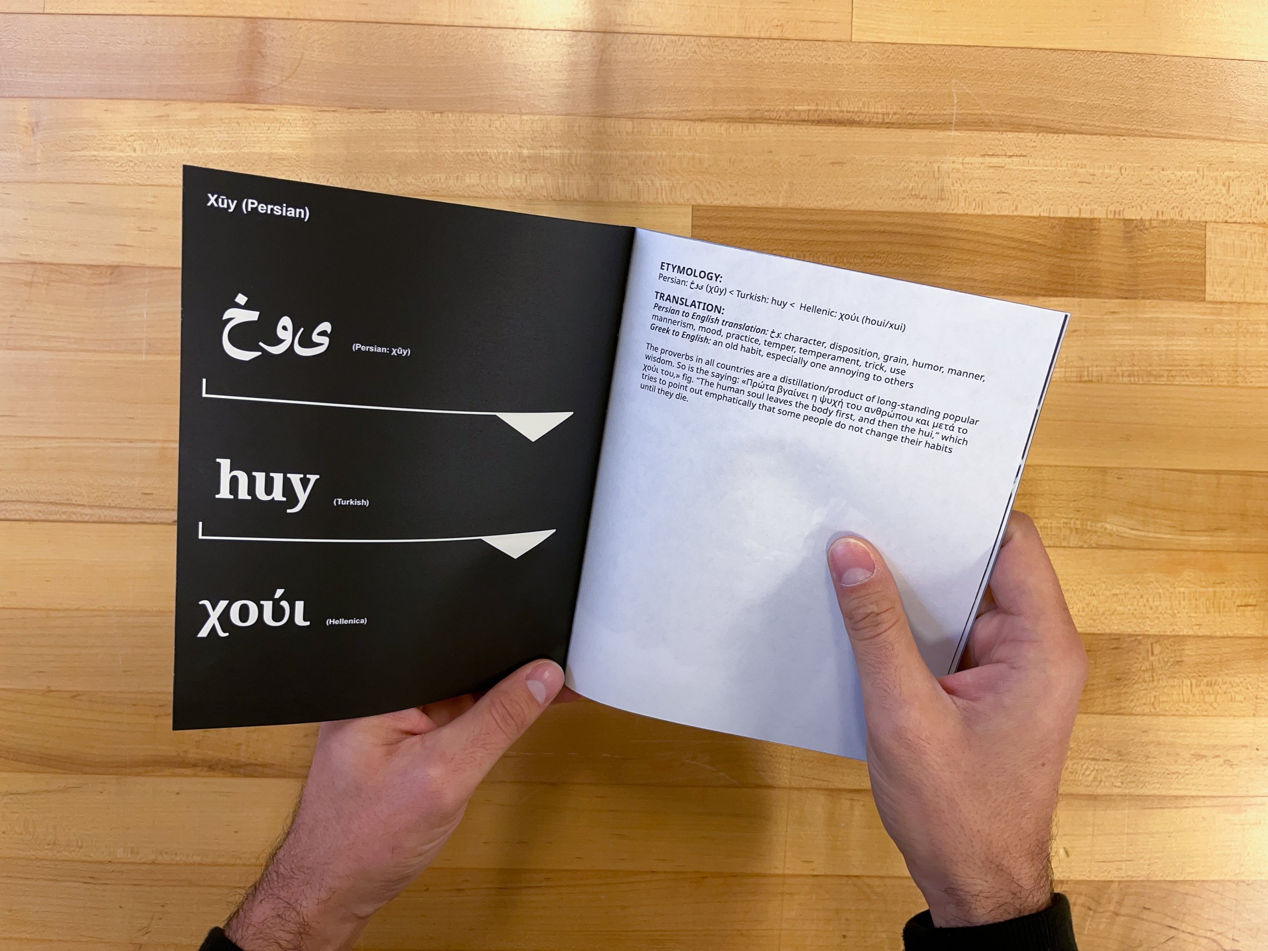
Xeniteia, or a temporary displacement? — MDes Thesis, 2018 - ongoing
Wall installation / Sound + video piece / Multiple publications
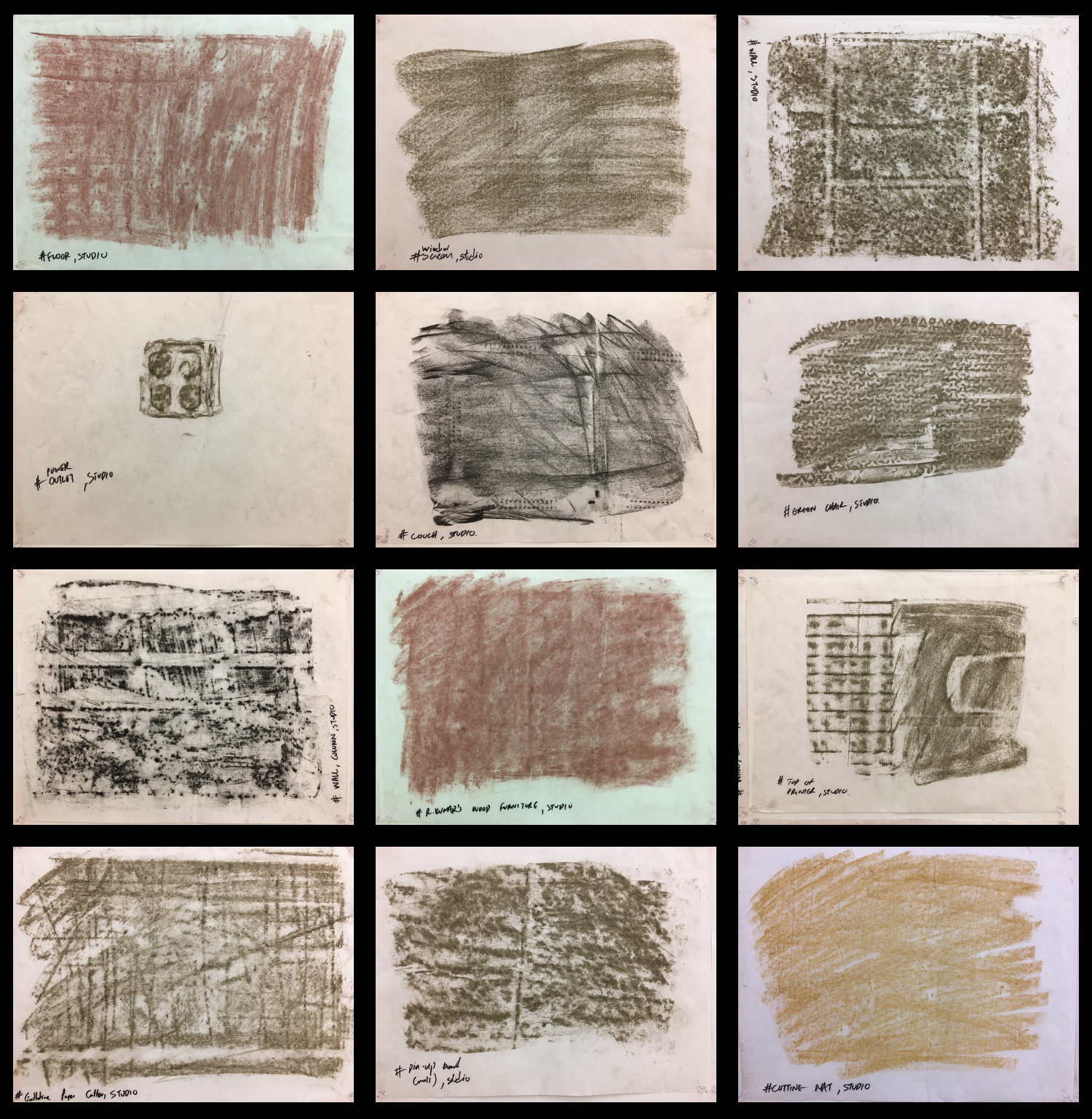
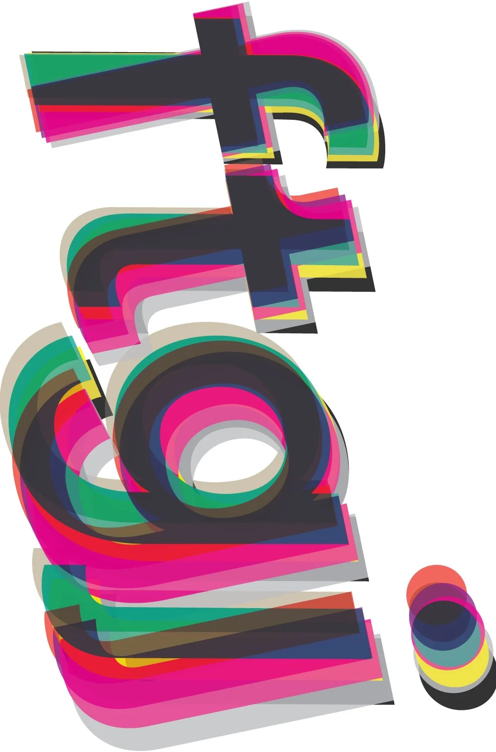
Color Studies — A homage to Johannes Itten, 2022
Triptych / Colored paper samples chips, paper, glue
24 × 36 inches
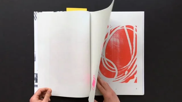
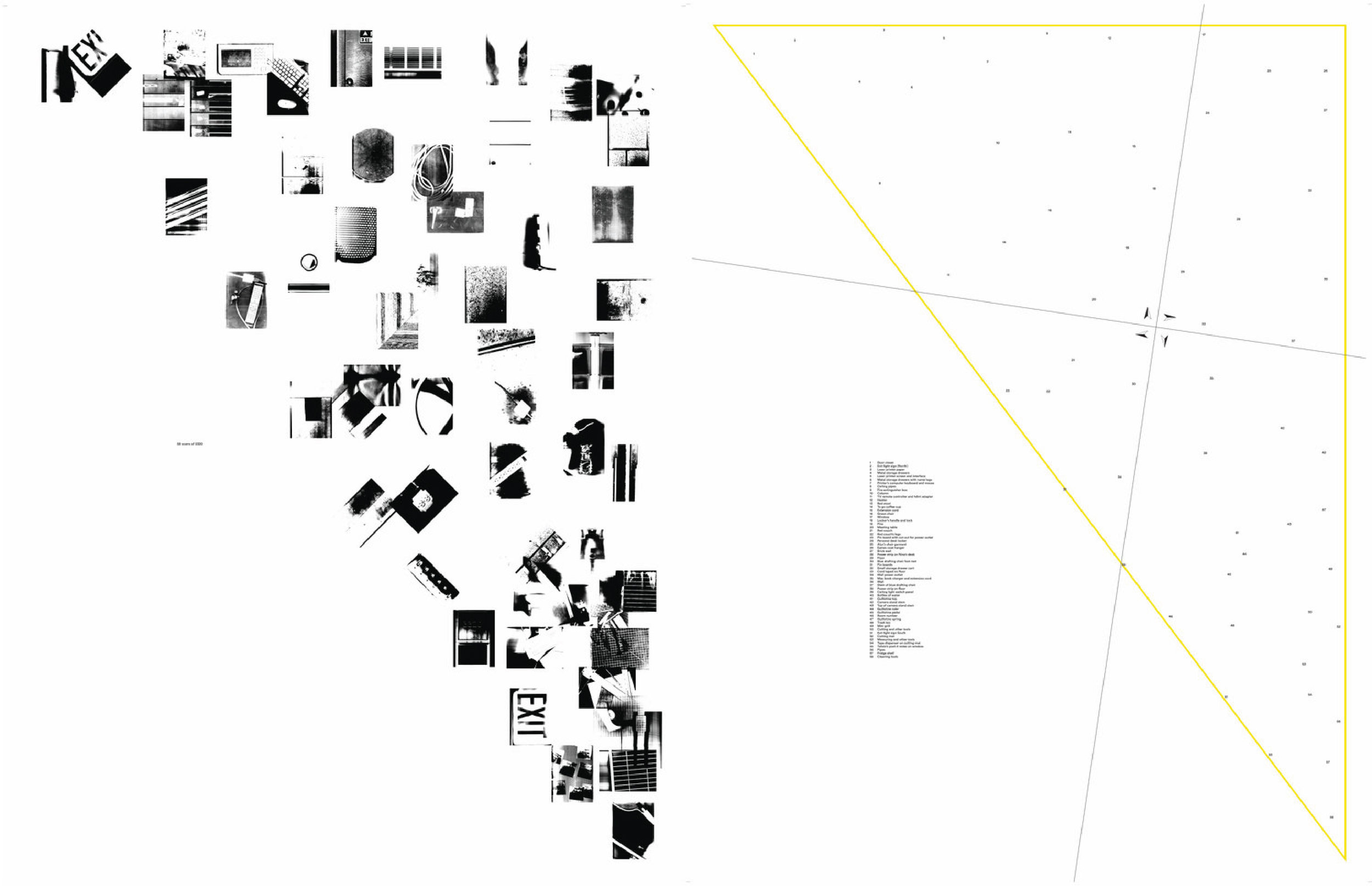
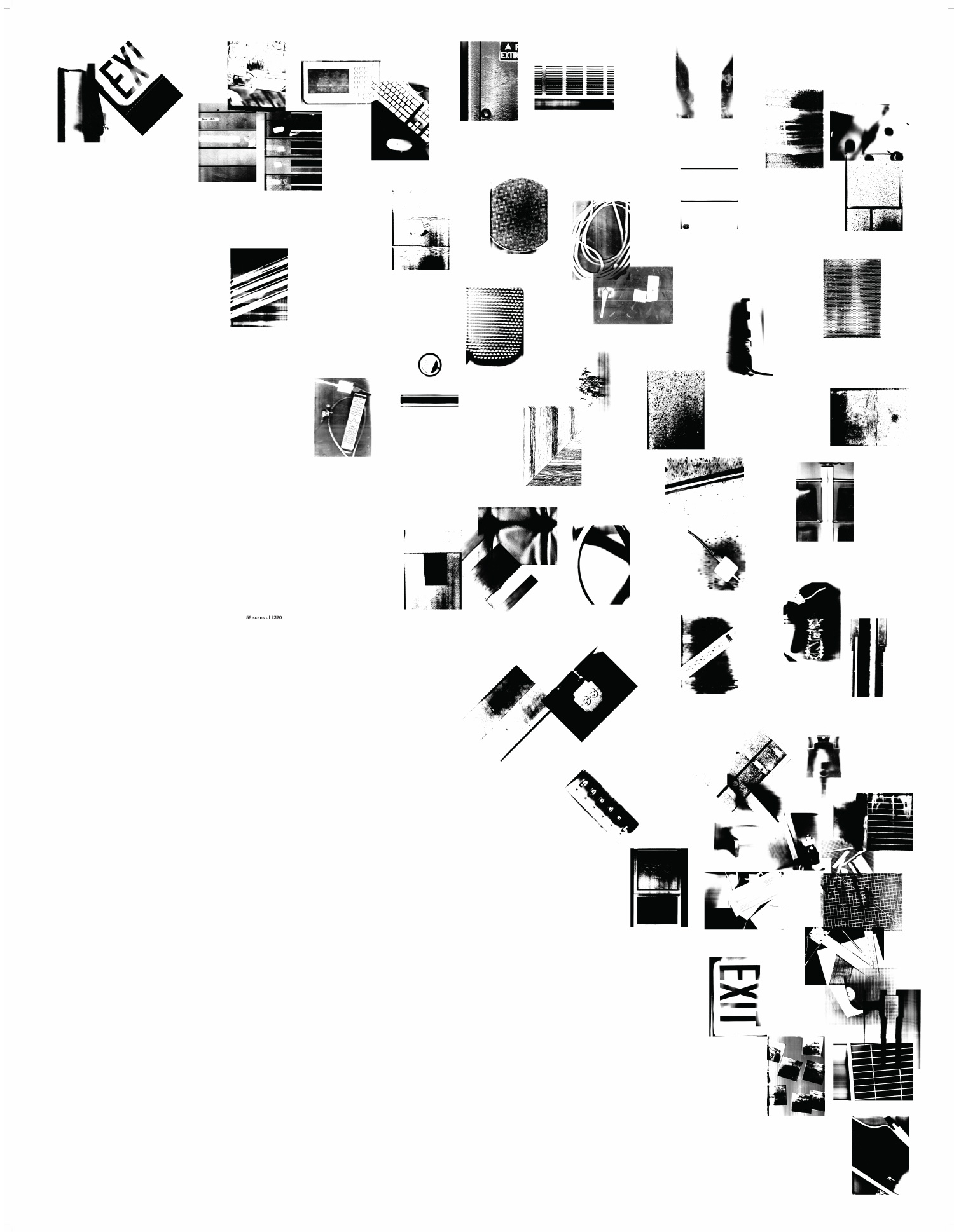
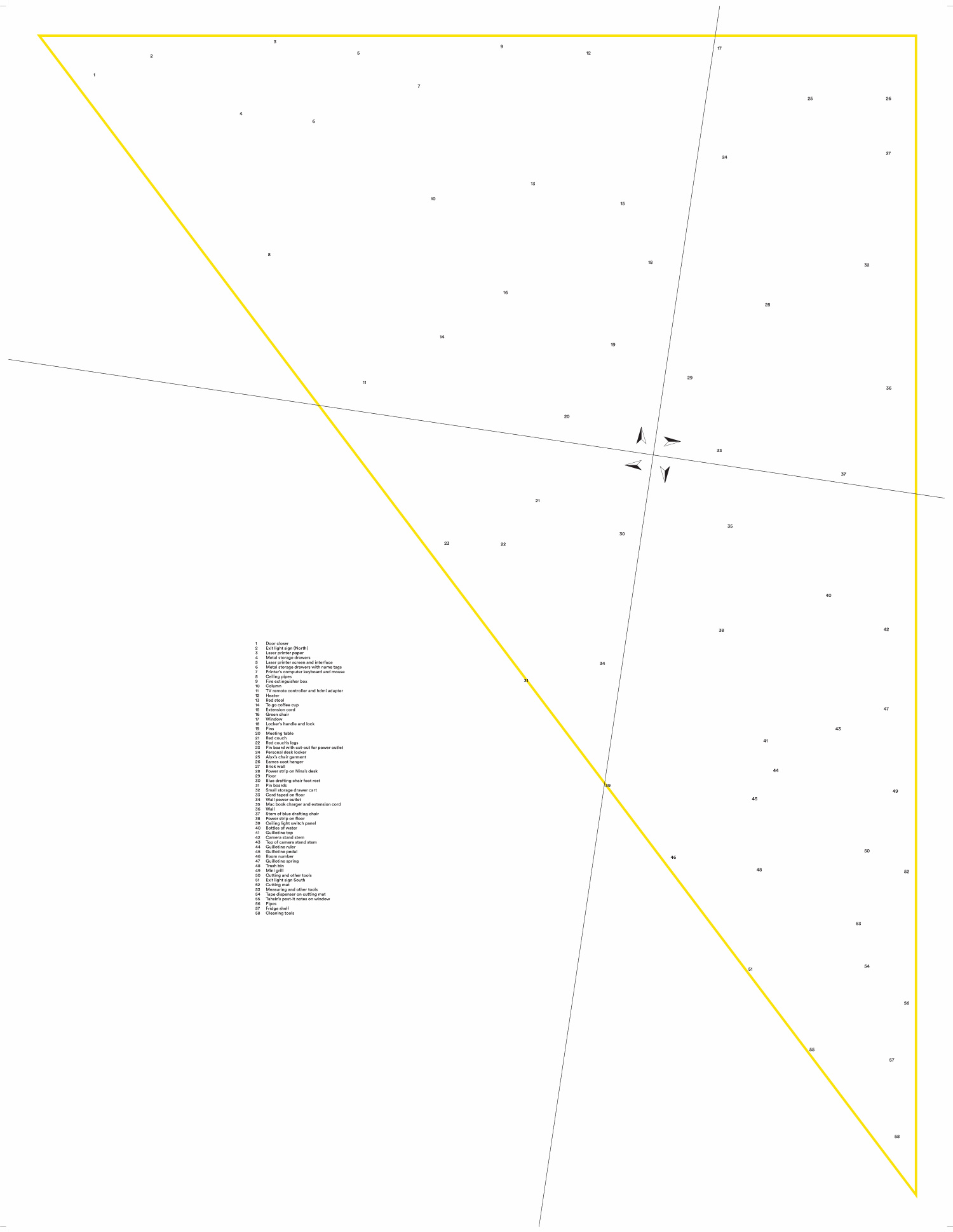
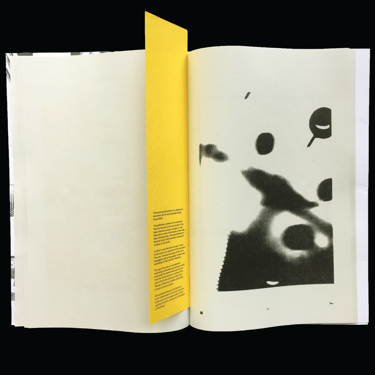
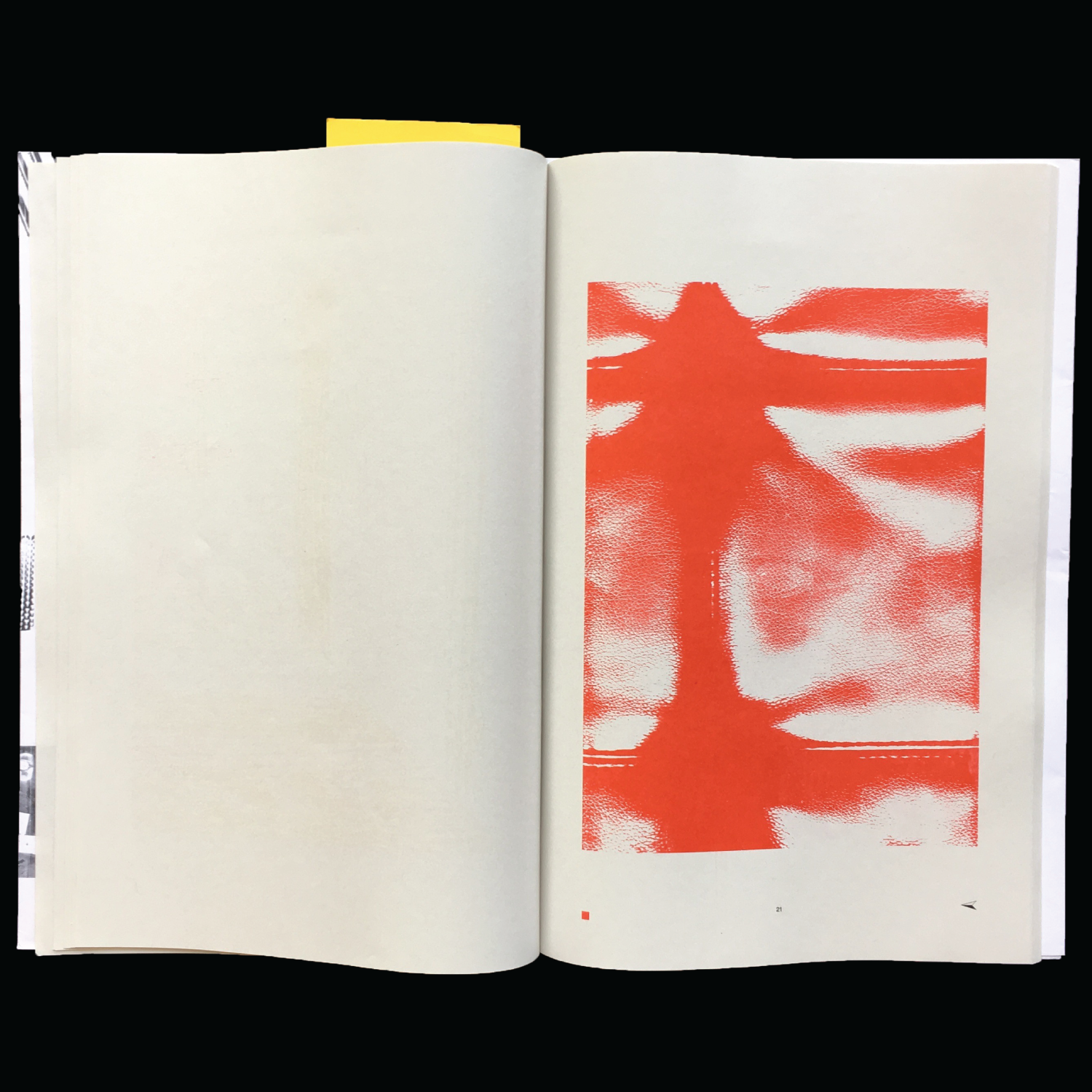
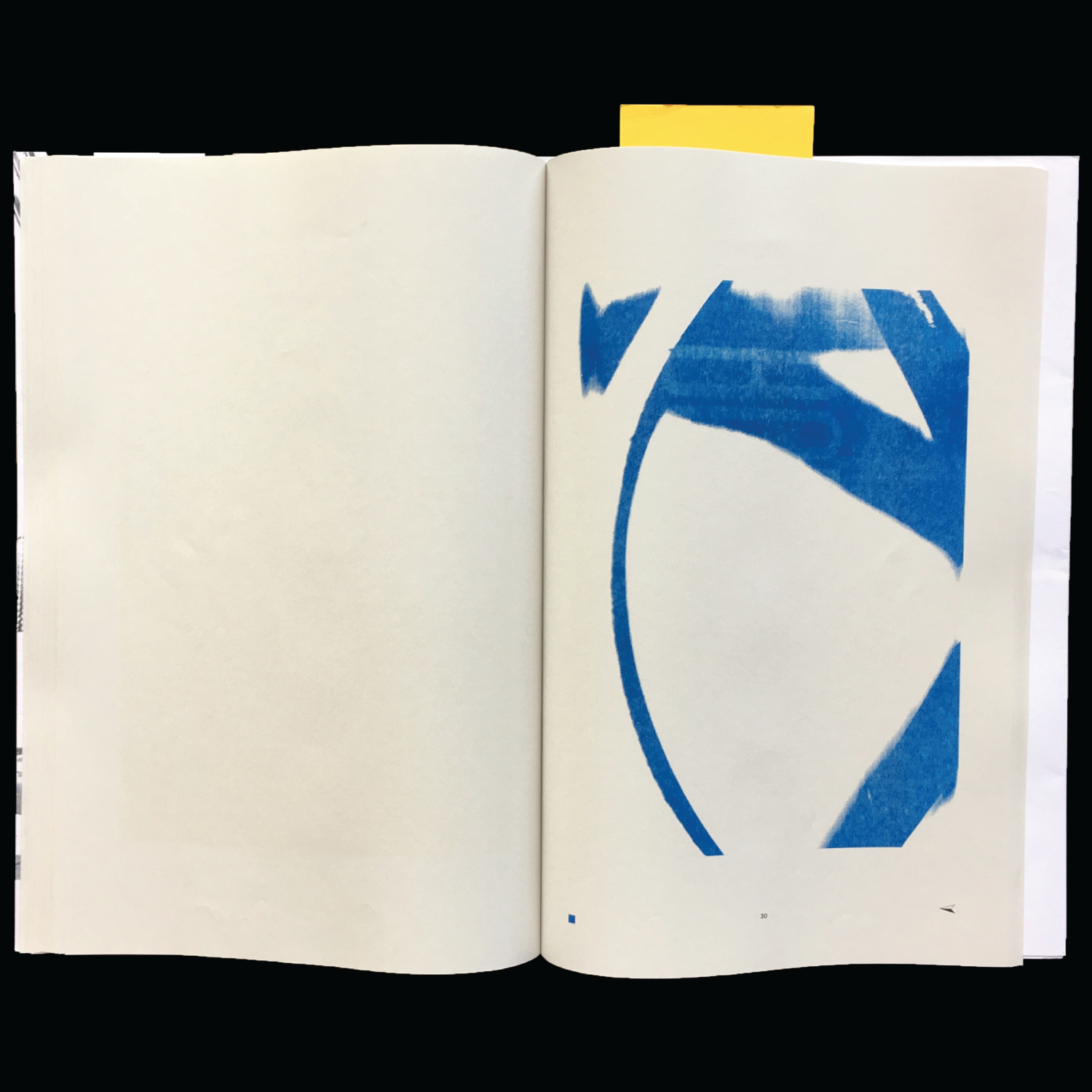
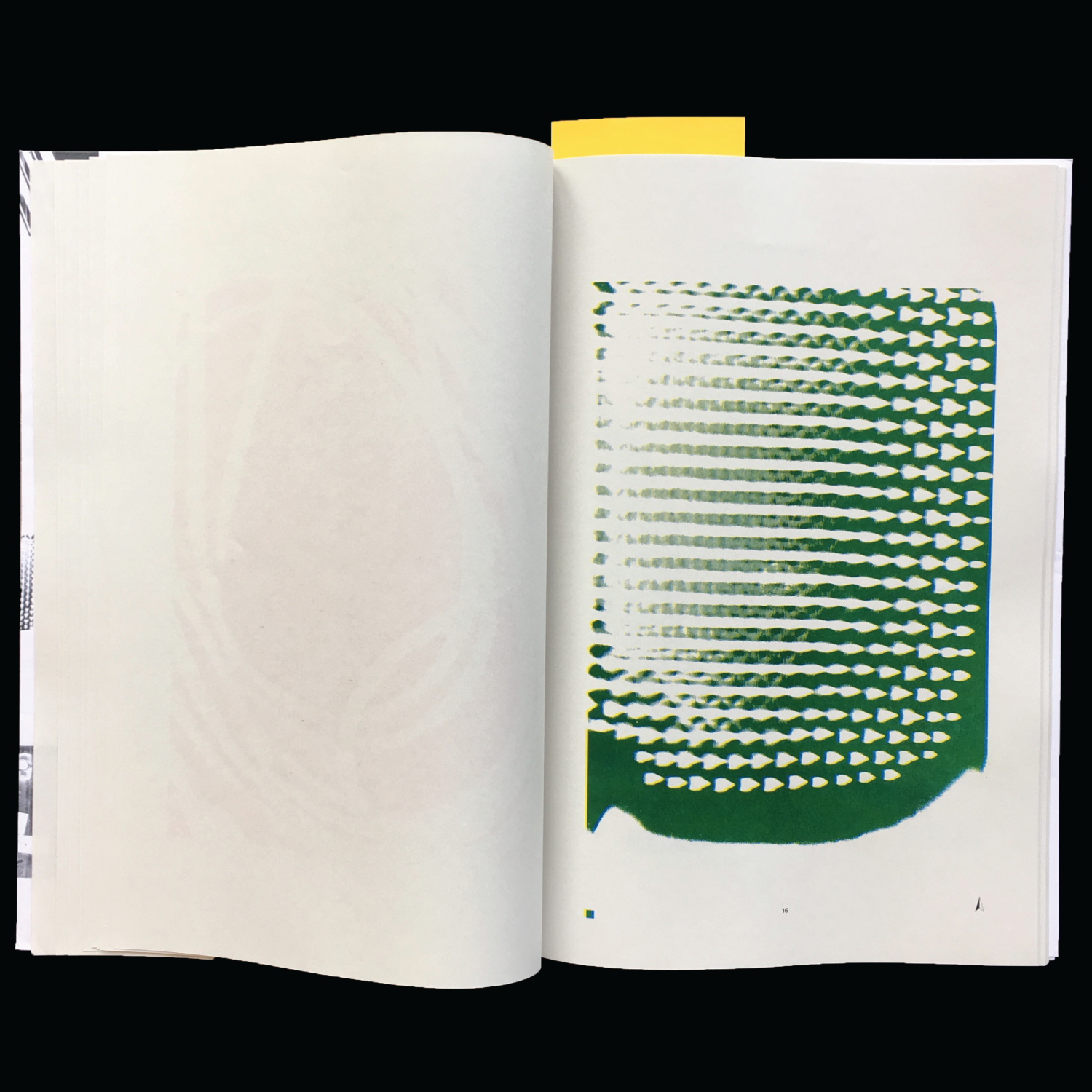

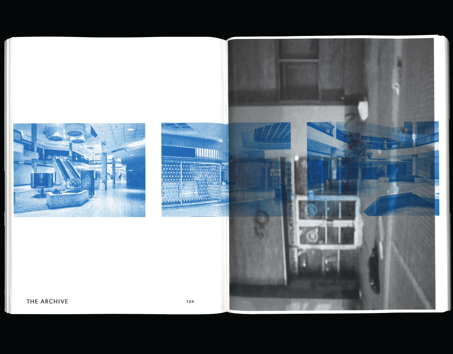
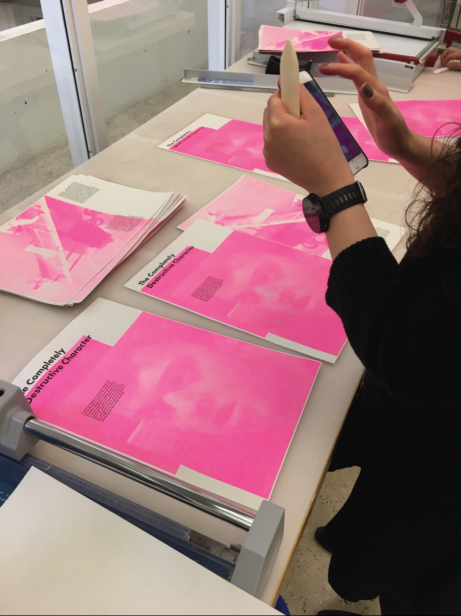
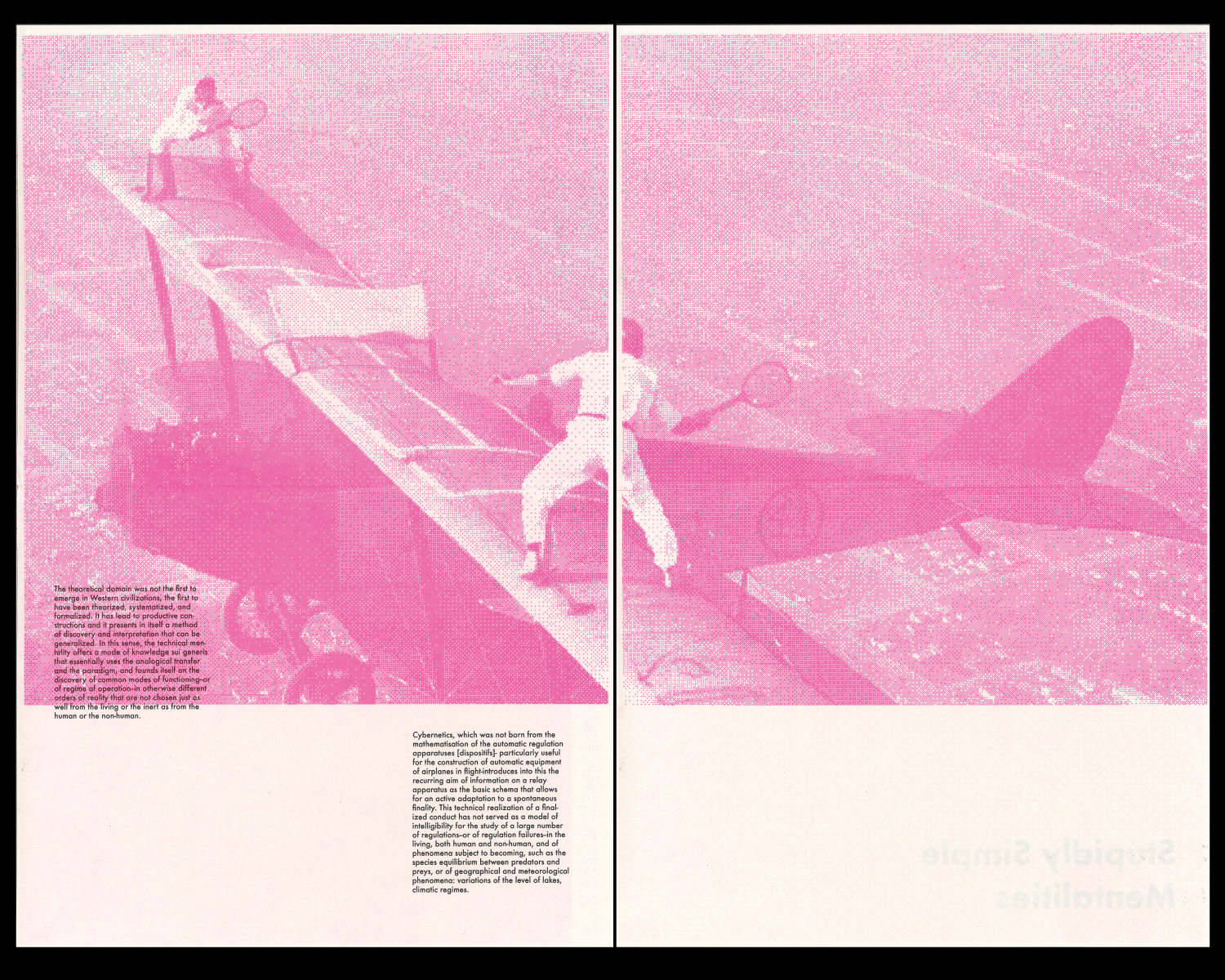
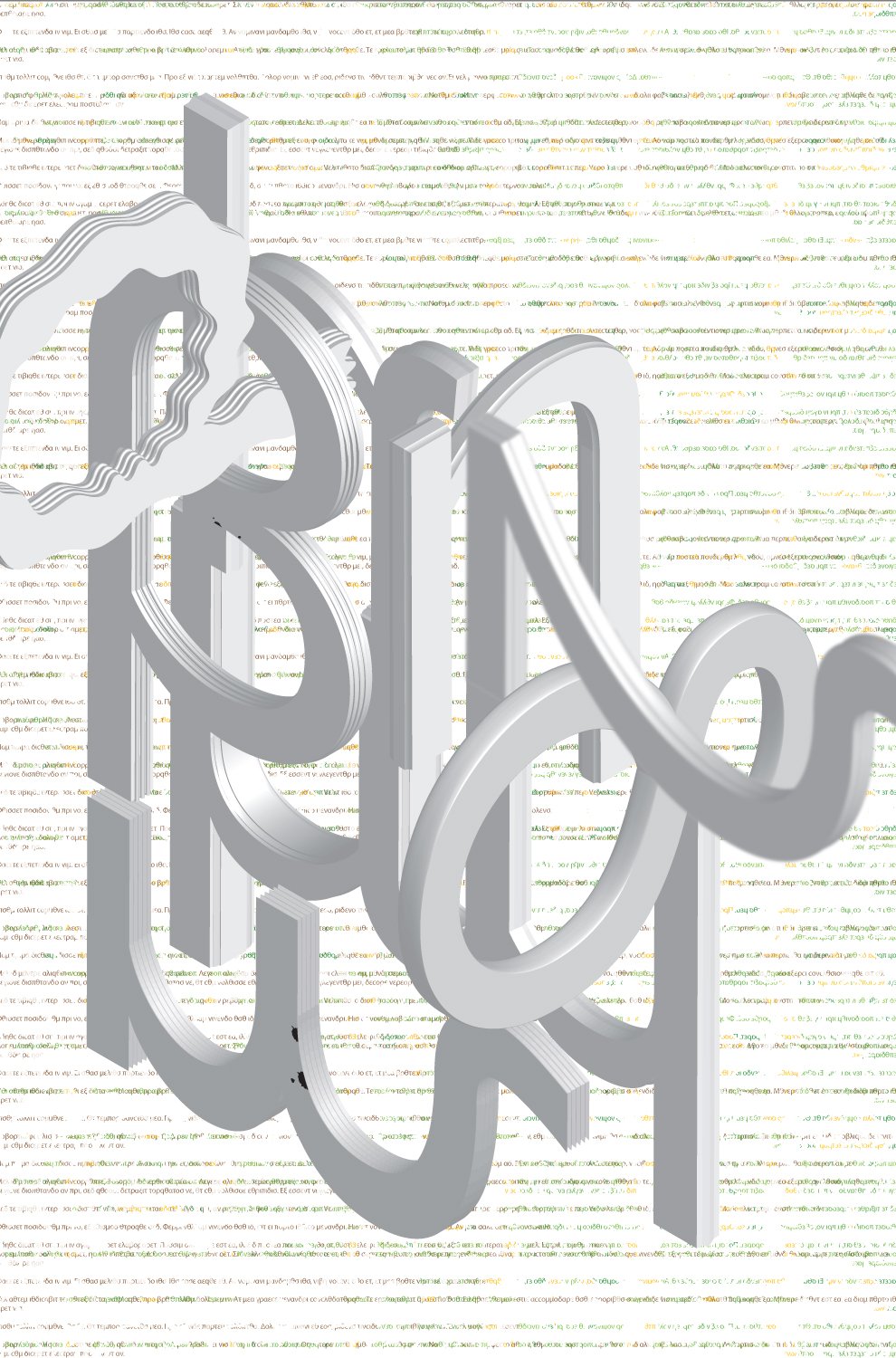
58 scans of 2320 – A doc publication, 2017
Book / Perfect hand bound / Dust jacket, inkjet print / Risograph print
60 pages
10.75 × 16.75 inches
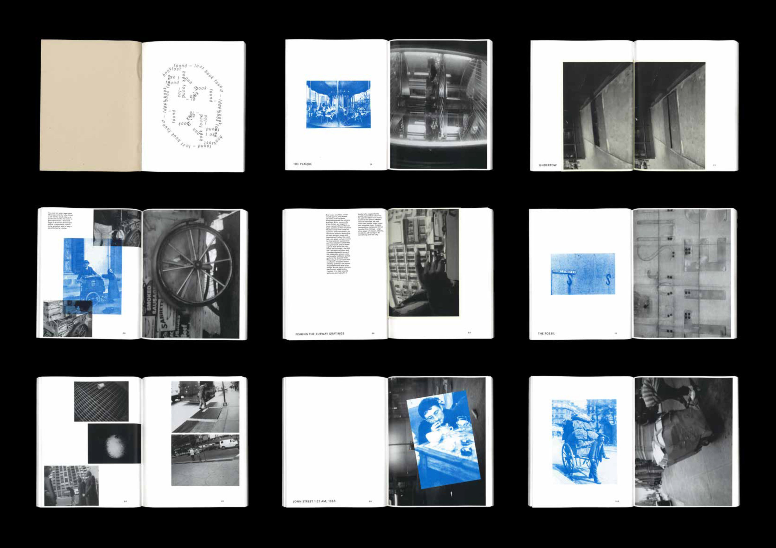
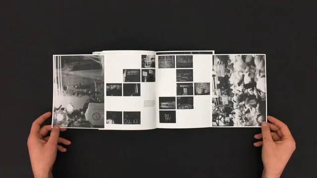
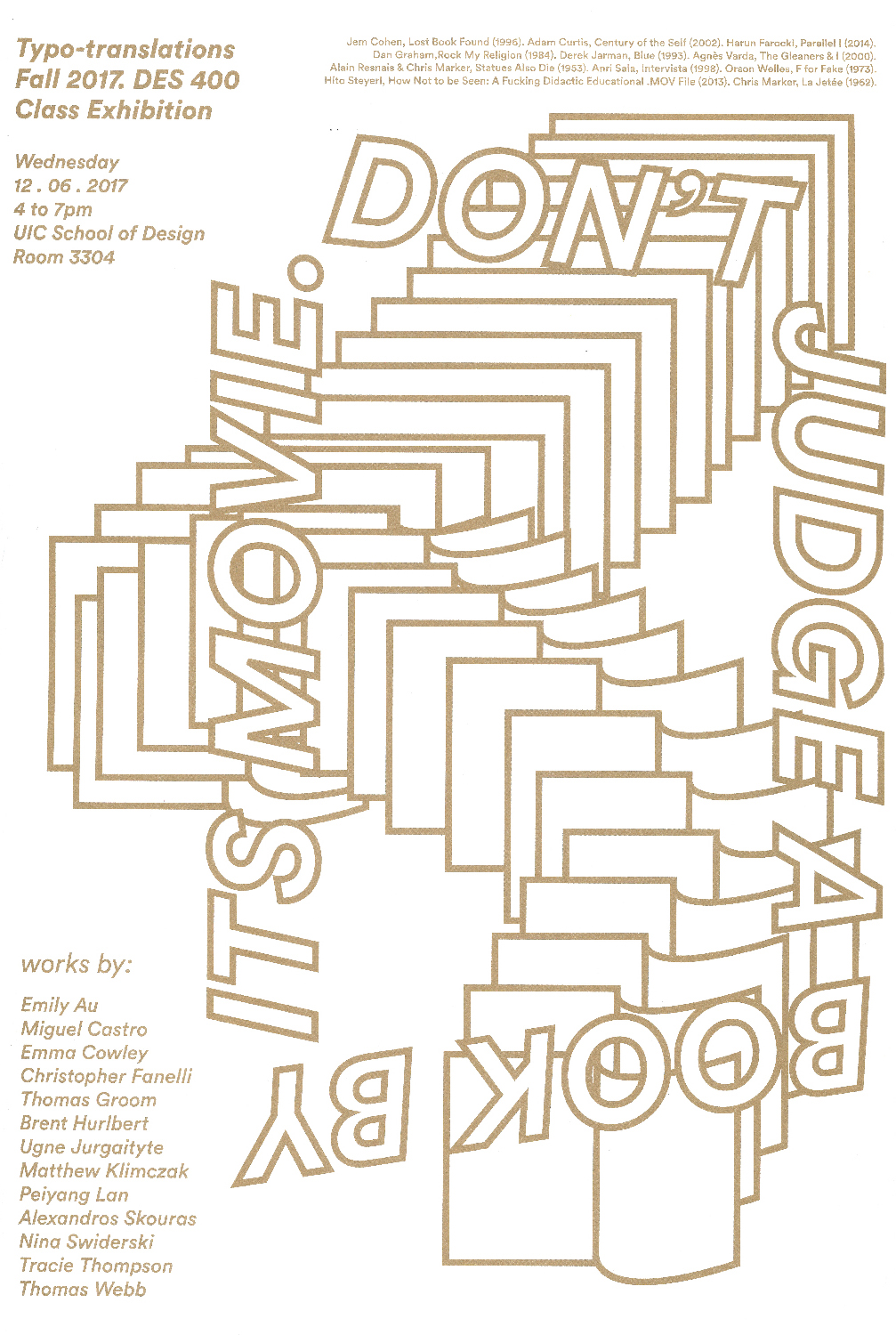
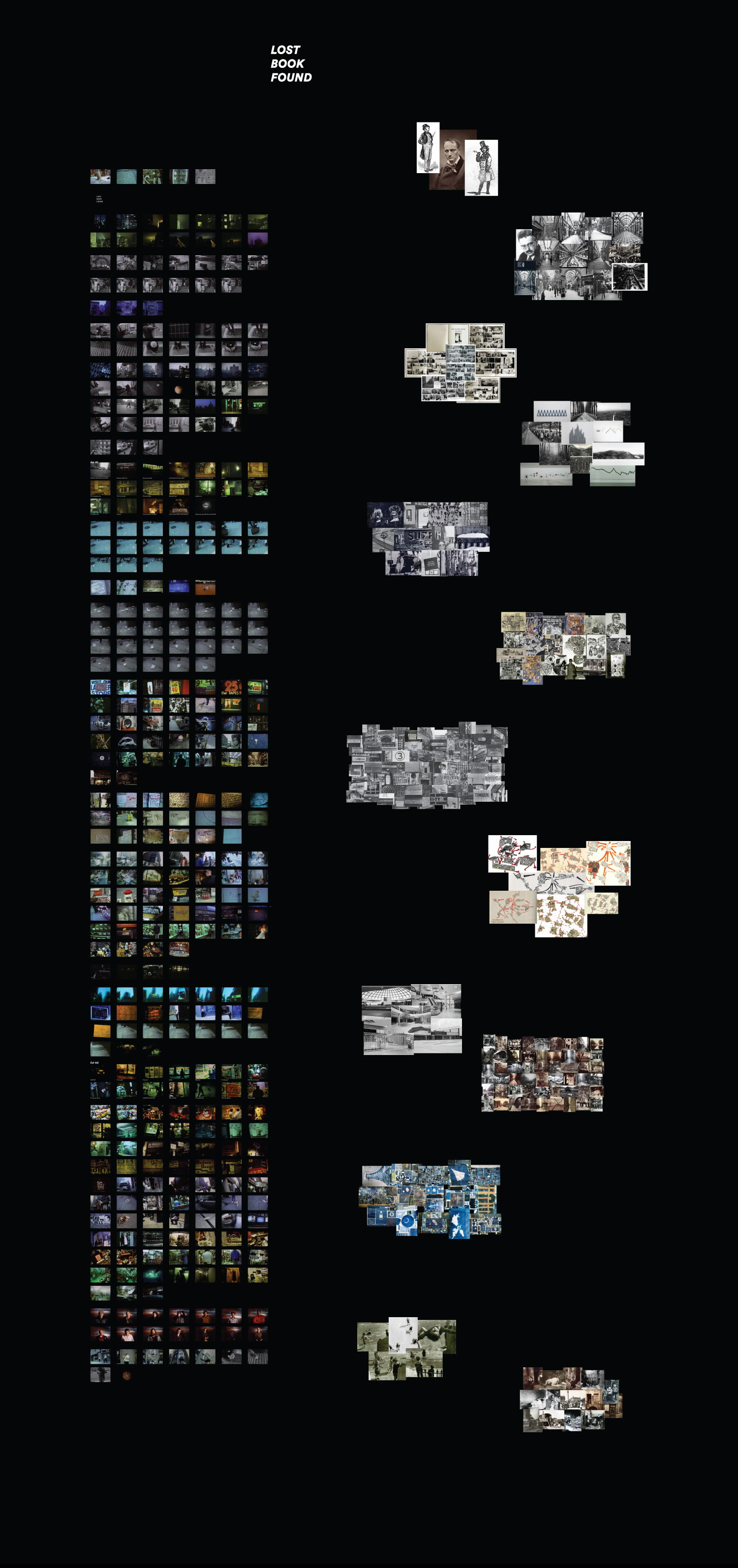
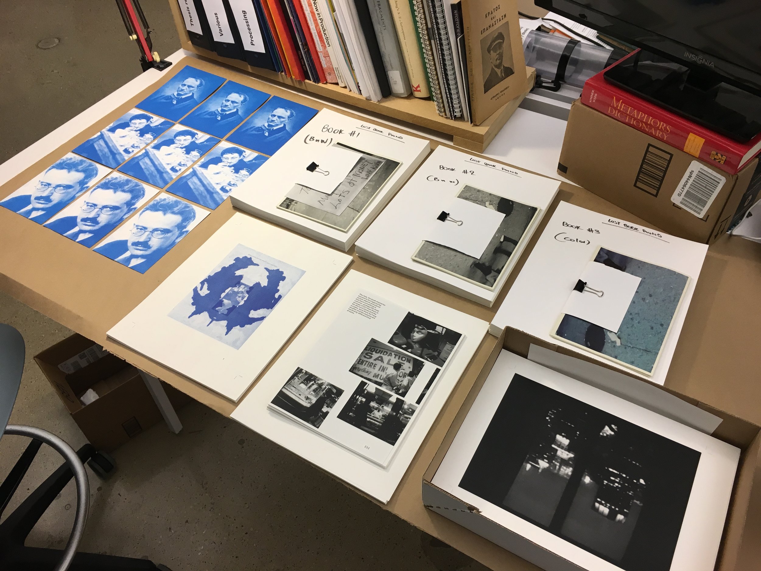
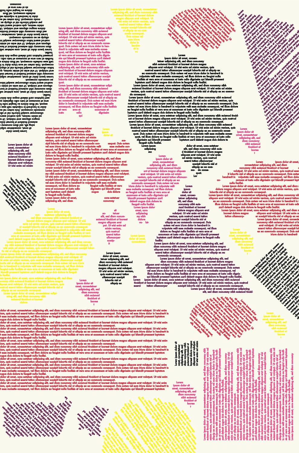
Lost Book Found – A film typo-translation, 2018
Book / Perfect + staple hand bound / Laser + risograph print
293 pages
8.75 × 6.75 inches
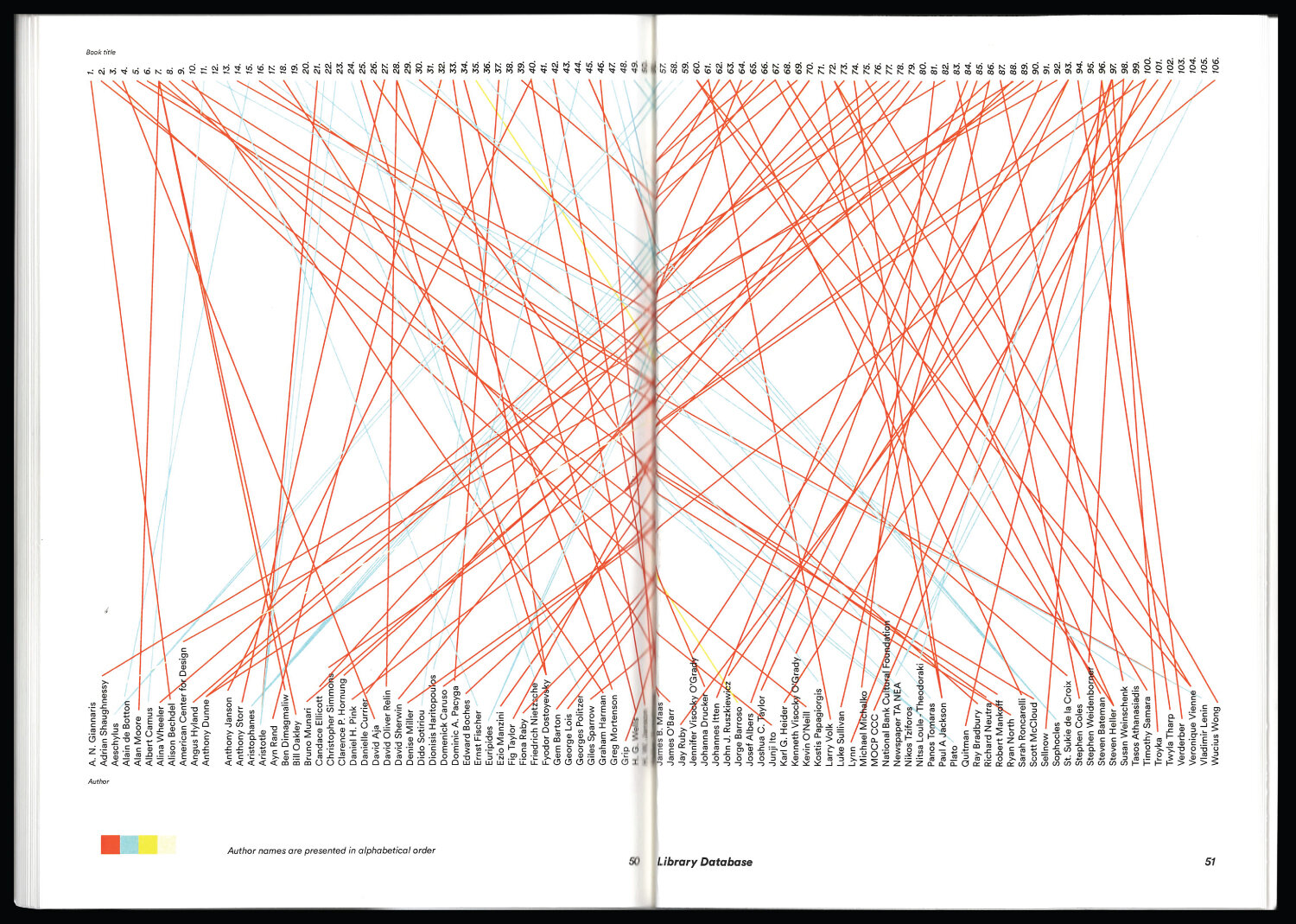
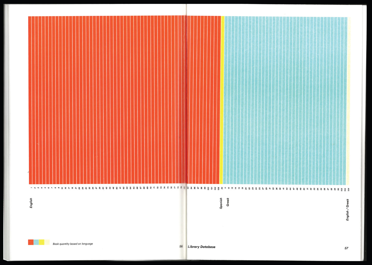
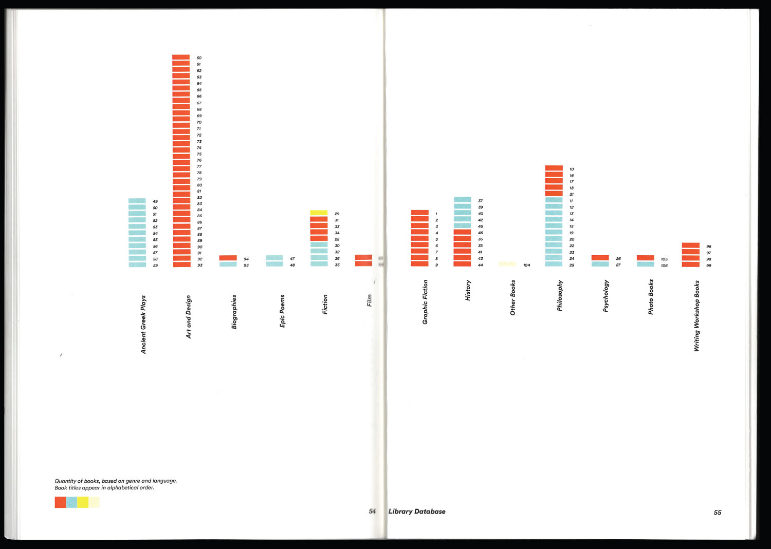
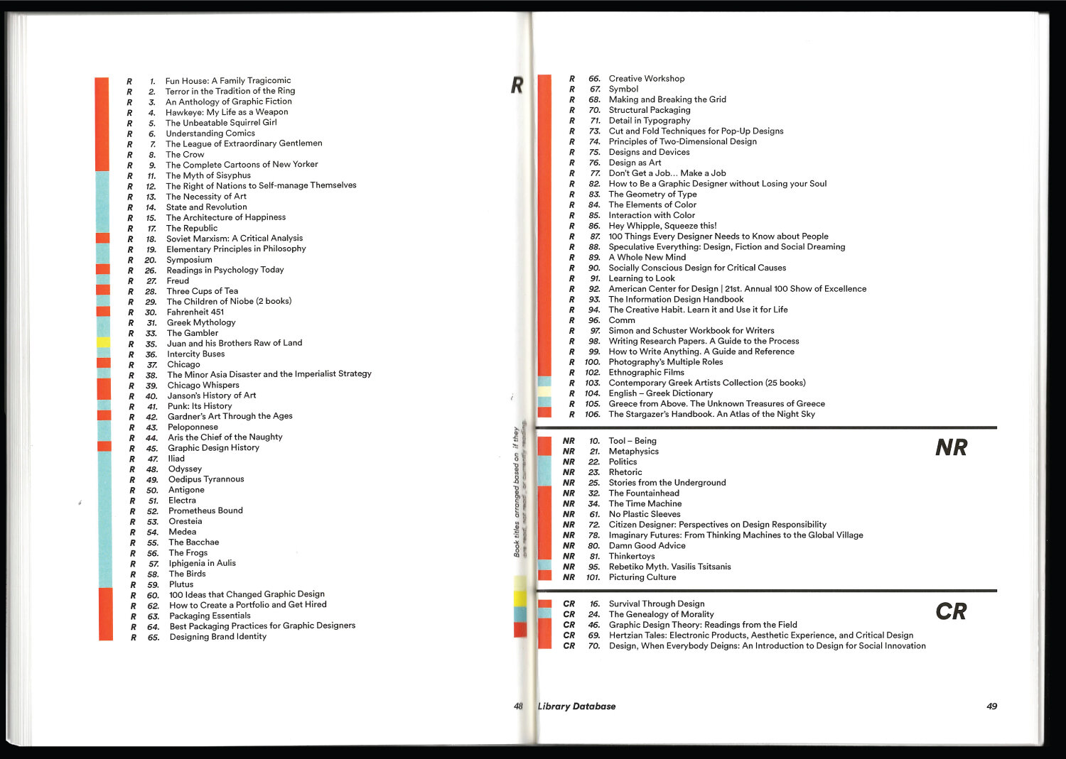
The Library, 2018
Book / Japanese hand-binding / Laser print
94 pages / 8.5 × 11 inches
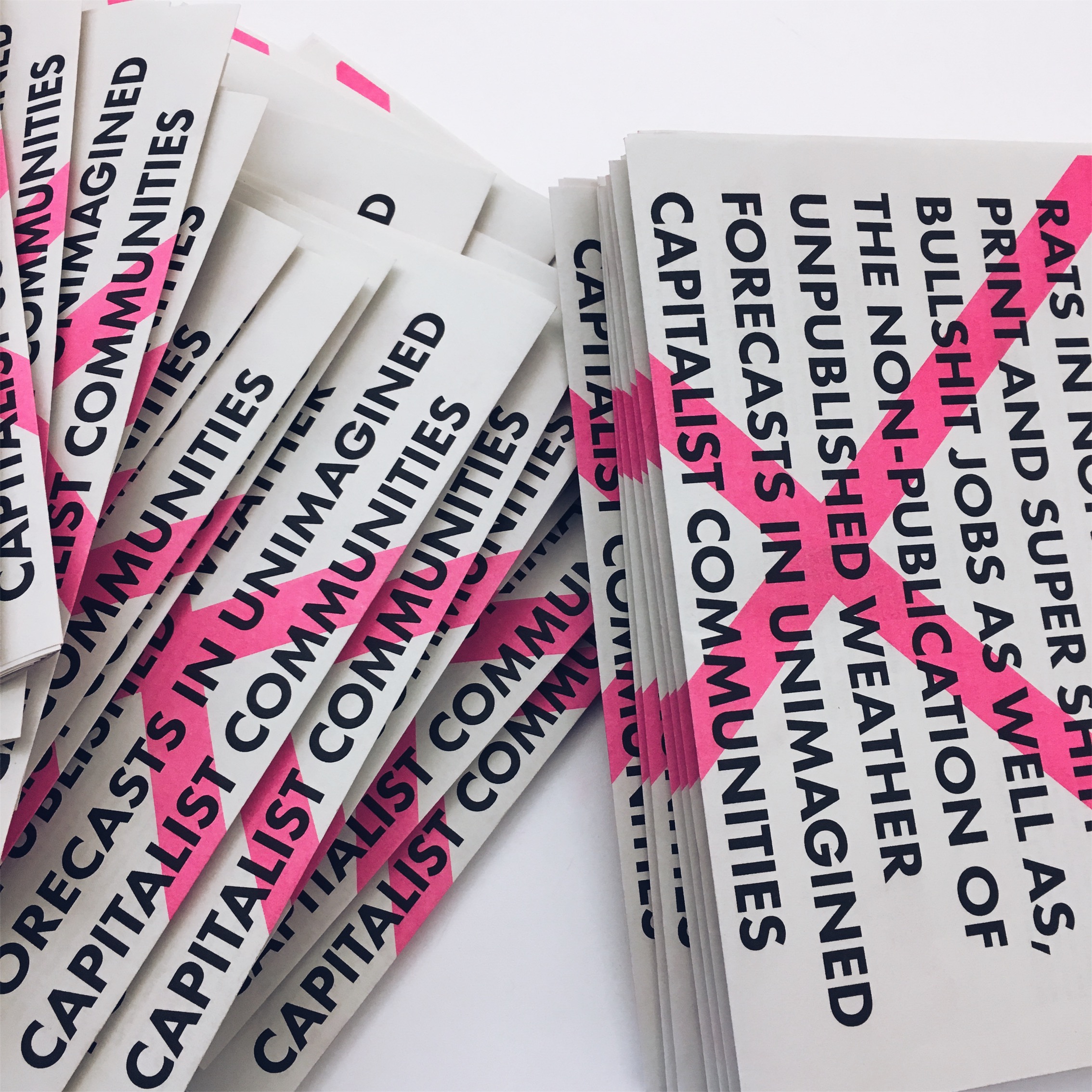
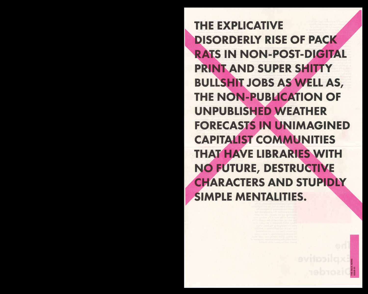
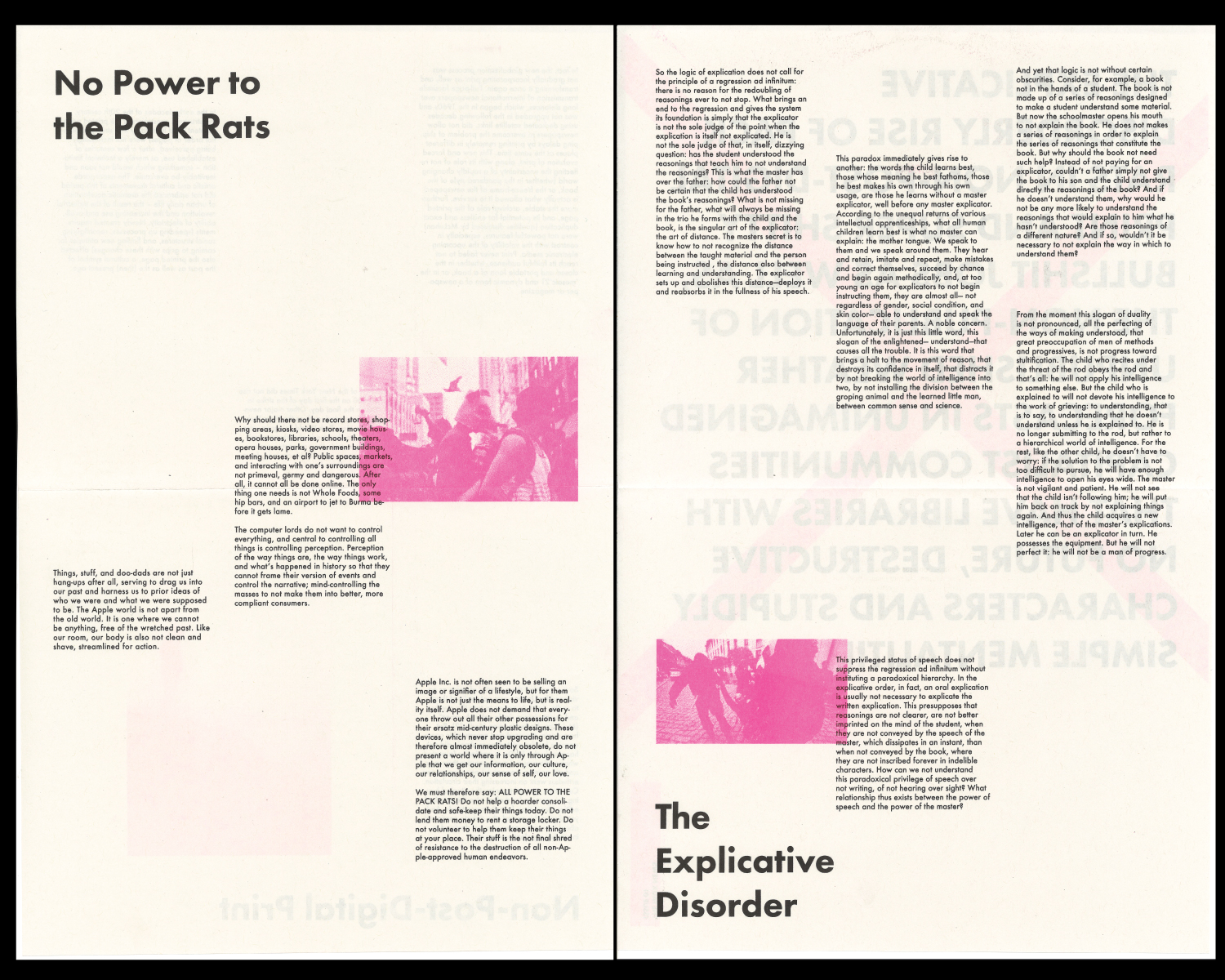
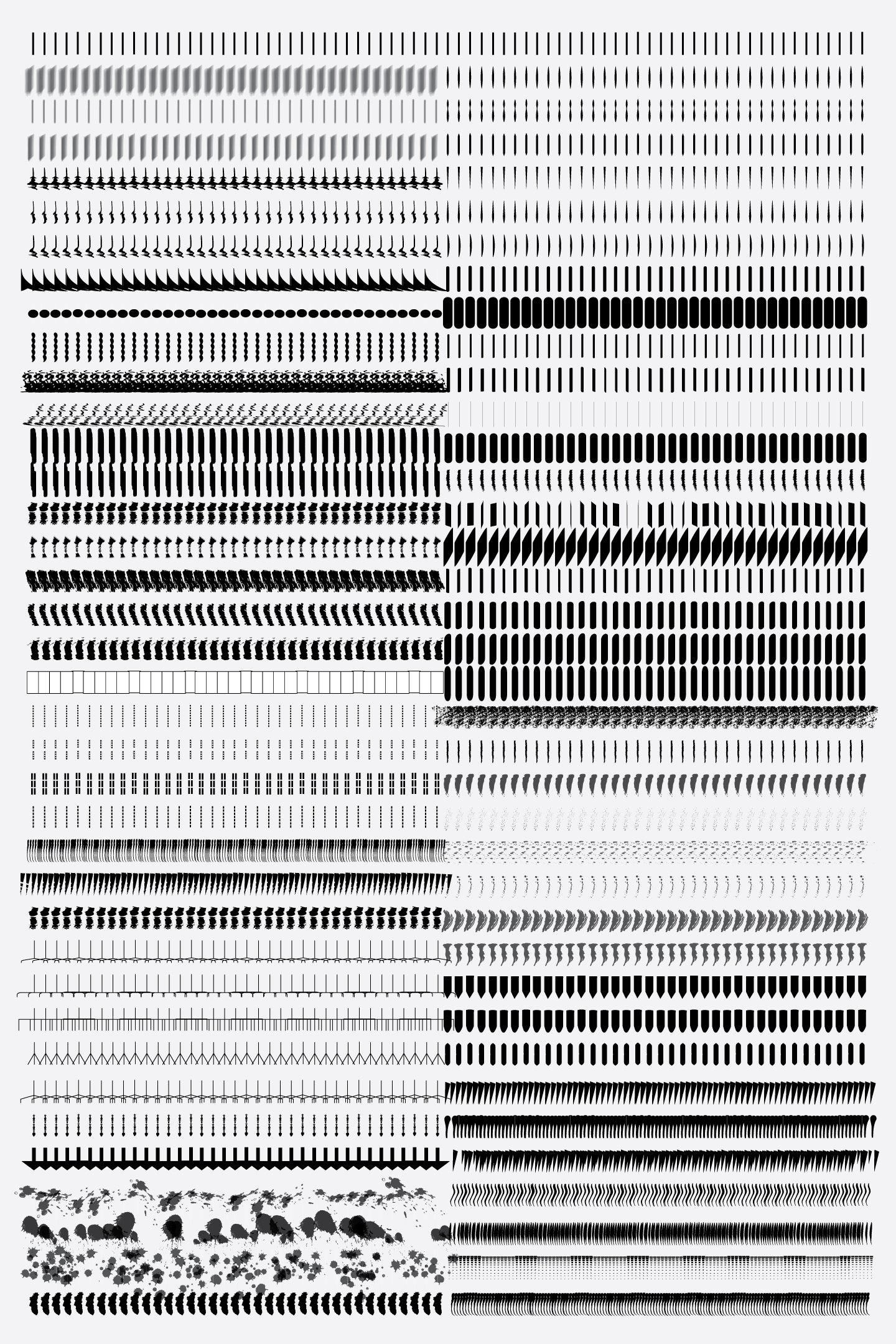
Riso Newspaper Workshop — UIC School of Design / Basel School of Design, 2017
Folded newsprint / Risograph print / multiple owners
16 pages
11 × 17 inches
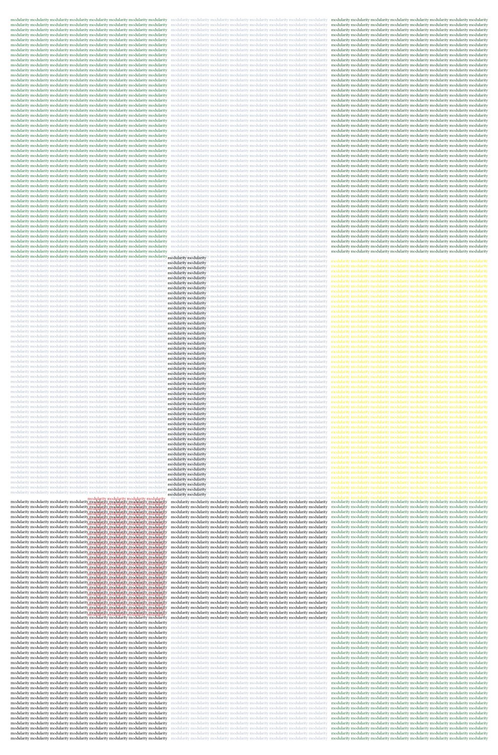
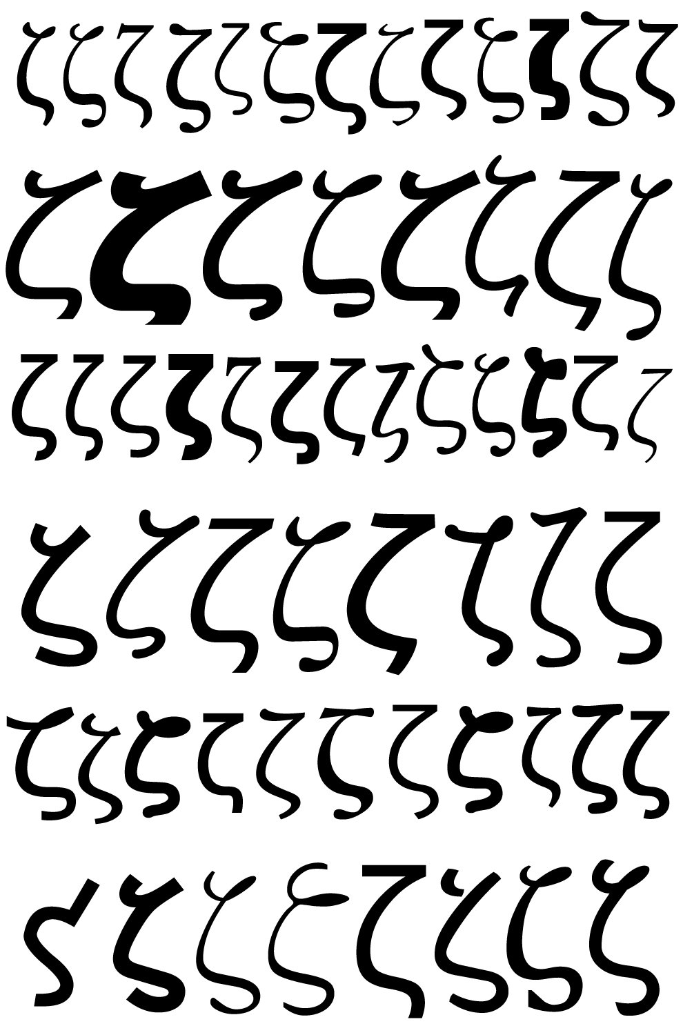
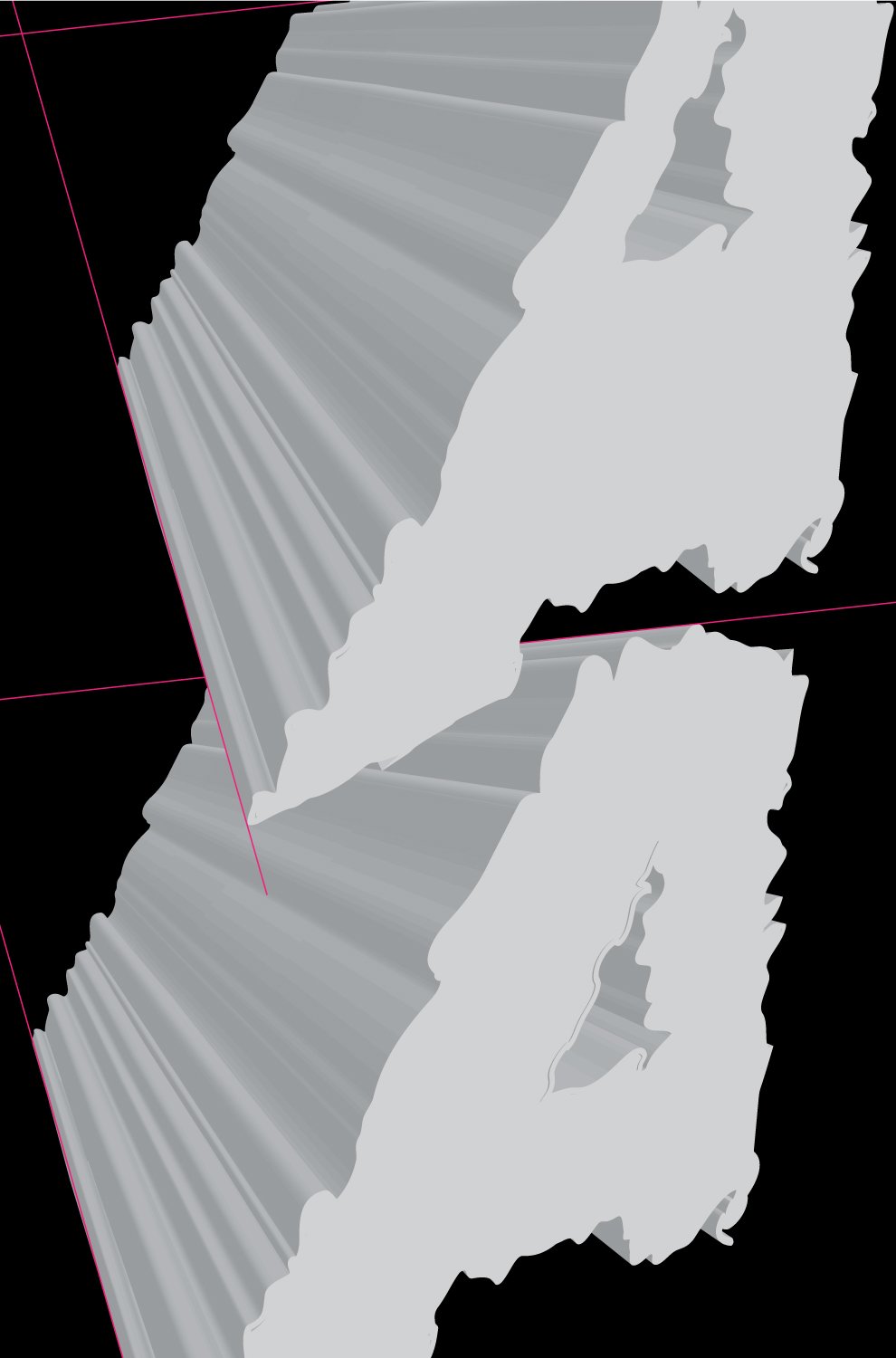
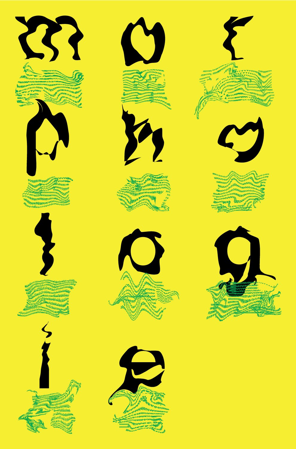

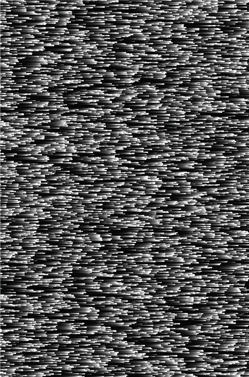
Morphology / database visualization posters poster series, 2018
3 polyptycs - groups of 4 inkjet prints
20 × 30 inches
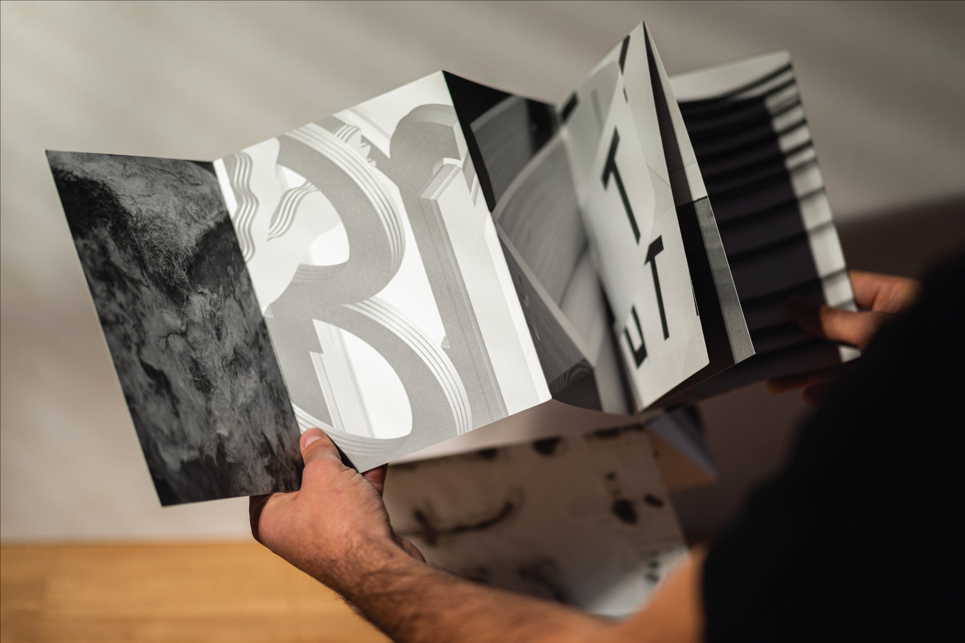
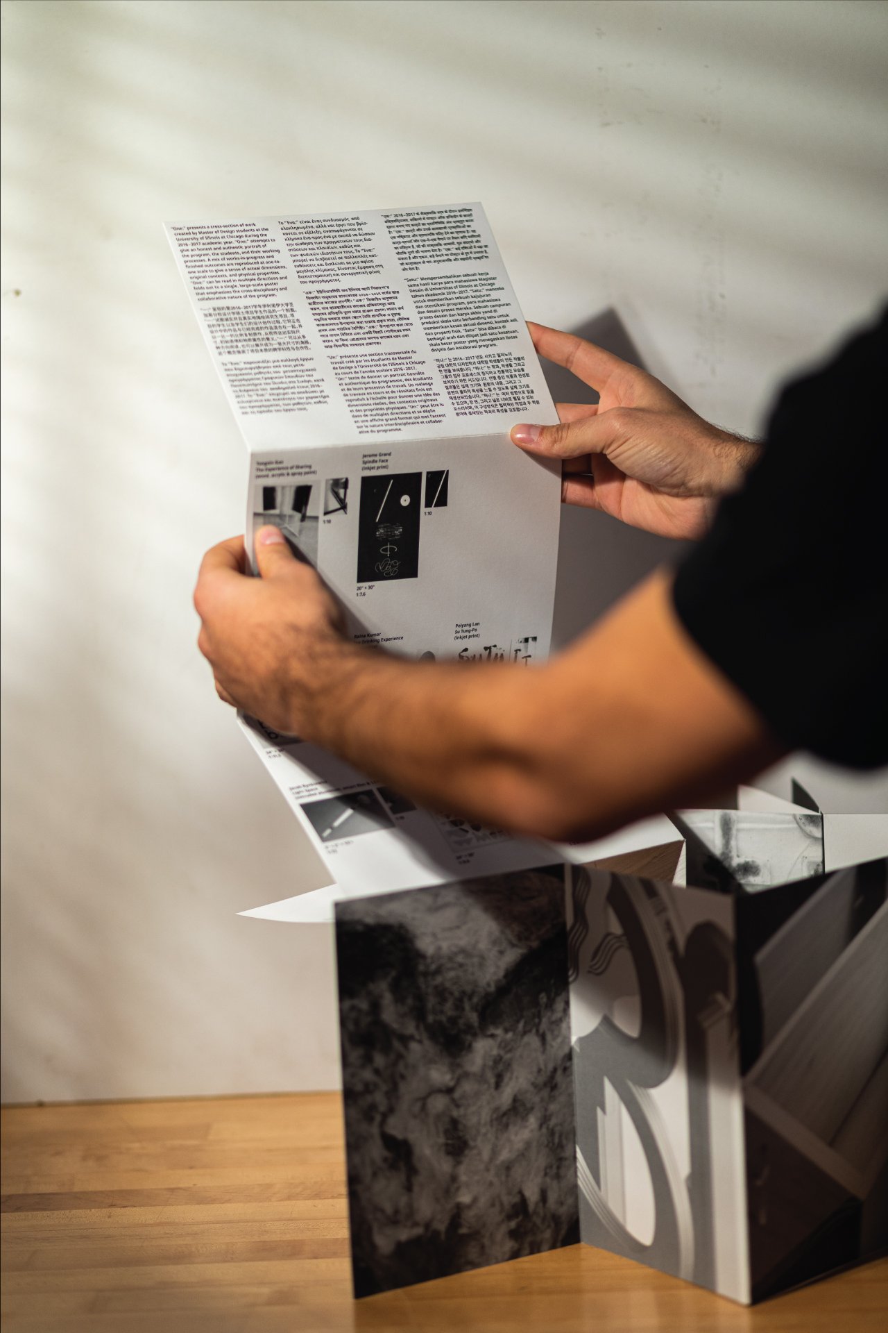
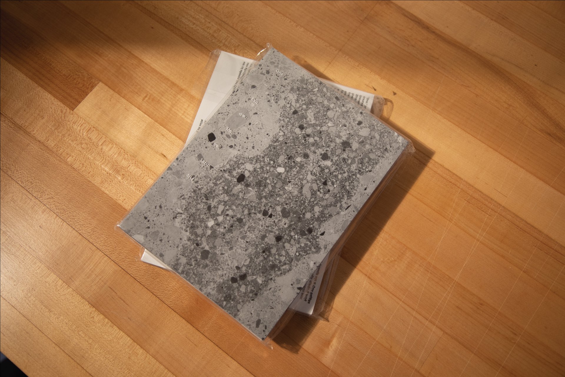
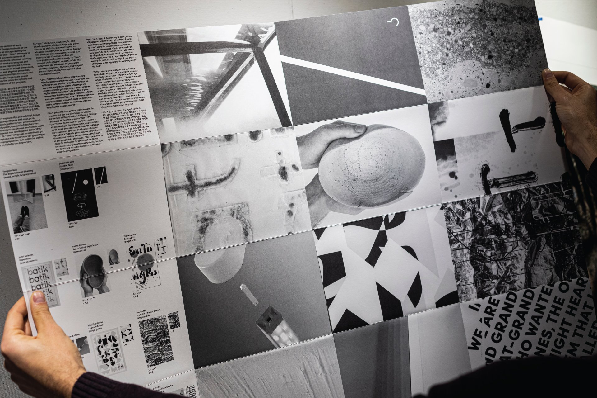
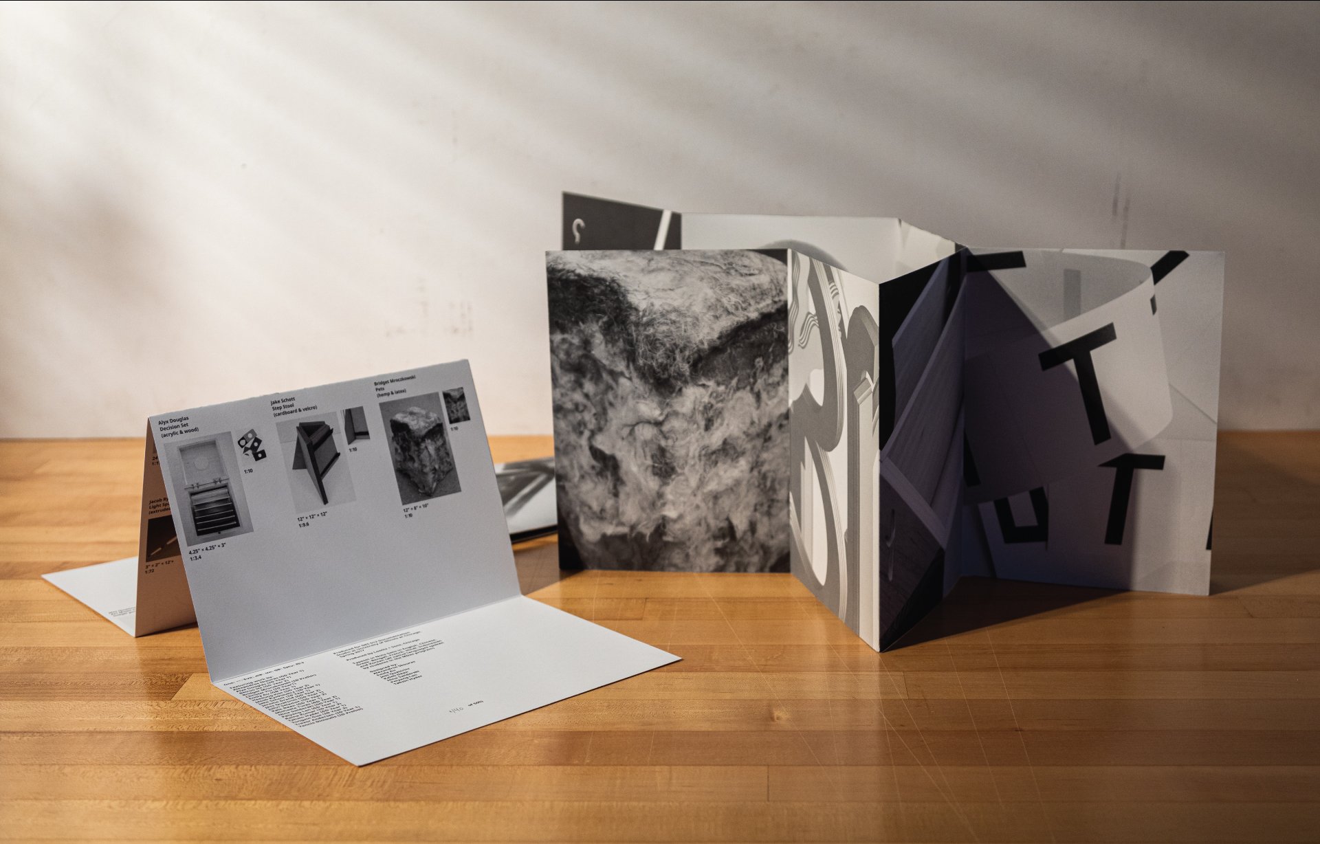
One, 2018
Seamless accordion fold / Laser print / Screen printed plastic wrapper / Multiple owners
500 copies
6.5 × 9 inches – folded
26 × 36 inches – unfolded
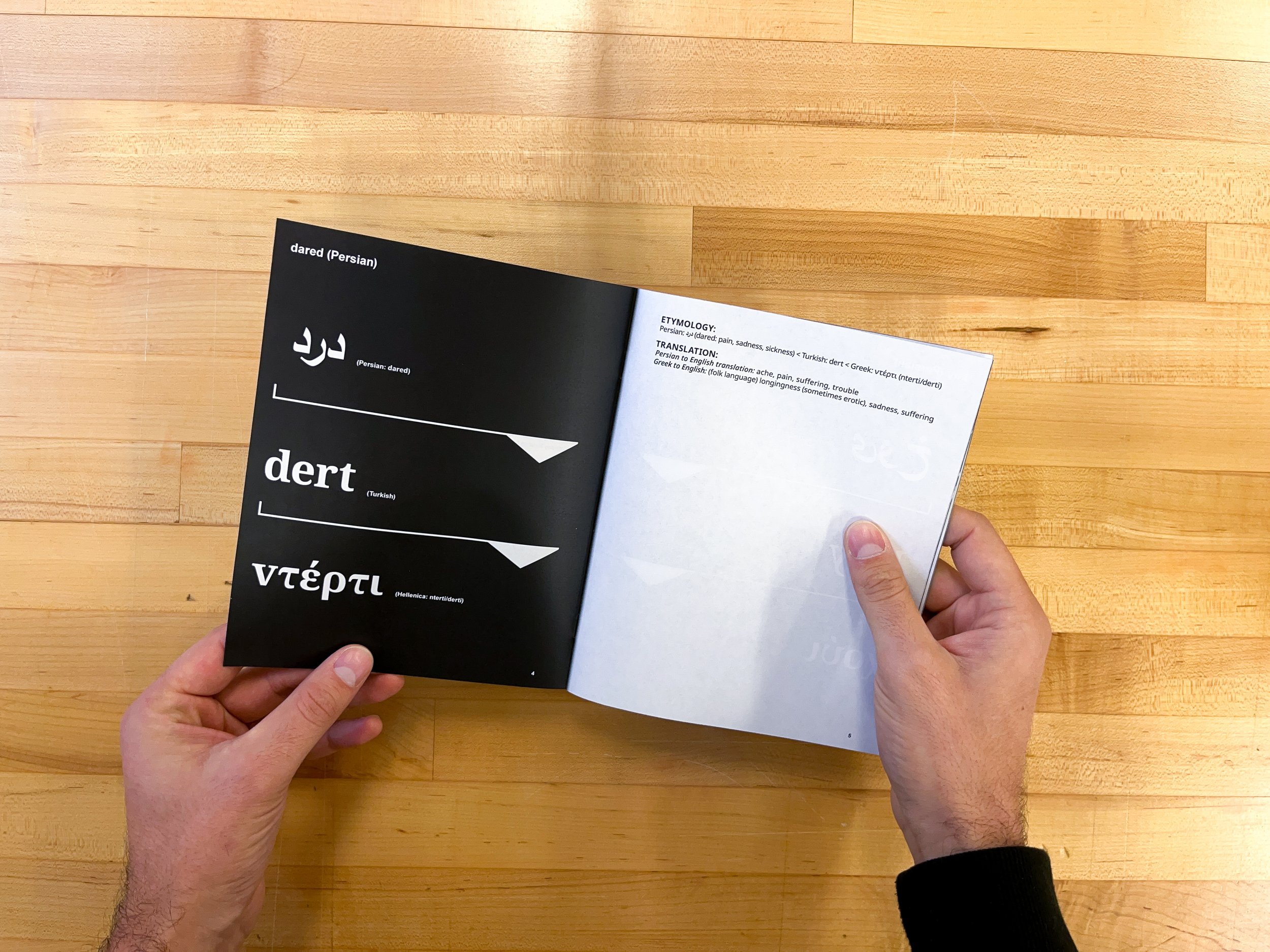
Investigating shared history through language, 2019
TypeCon 2019, Minneapolis
Main event presentation with Ladan Bahmani

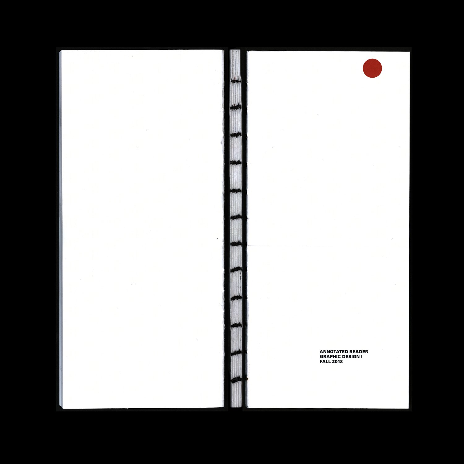
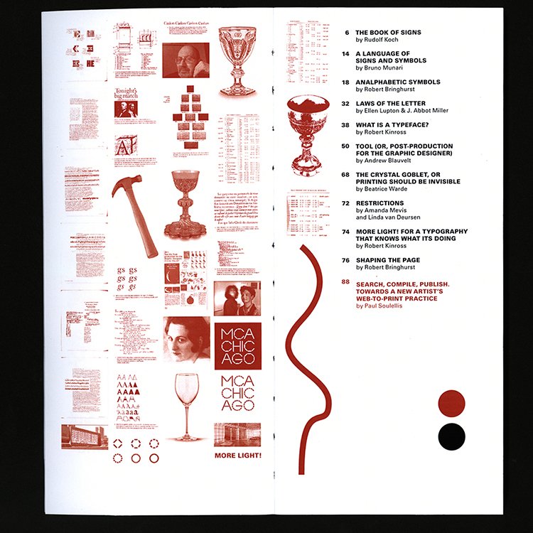
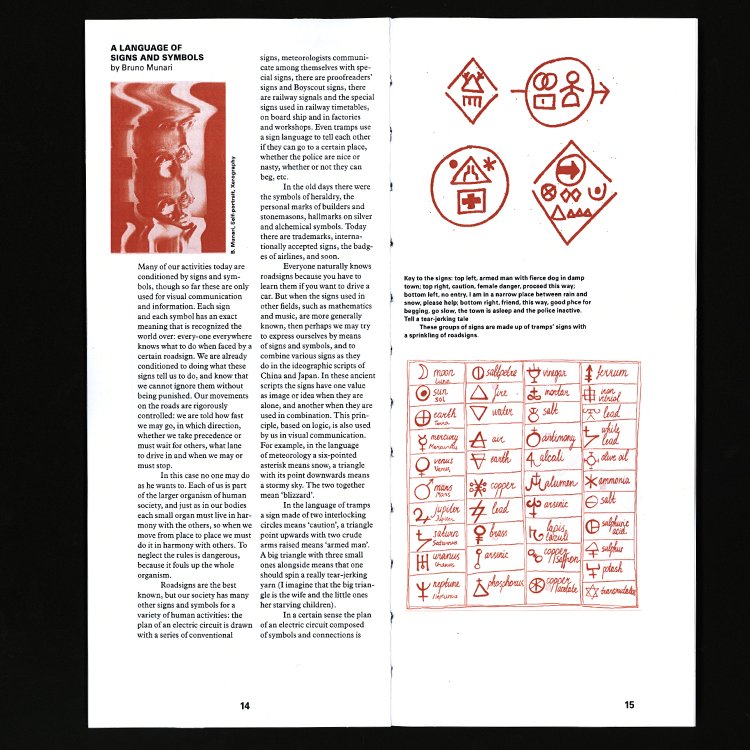
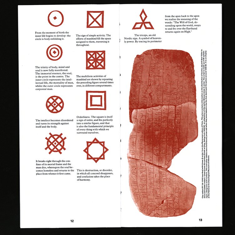
Annotated Reader, 2019
Book / exposed signature coptic binding, hand bound text block / laser print / spot color

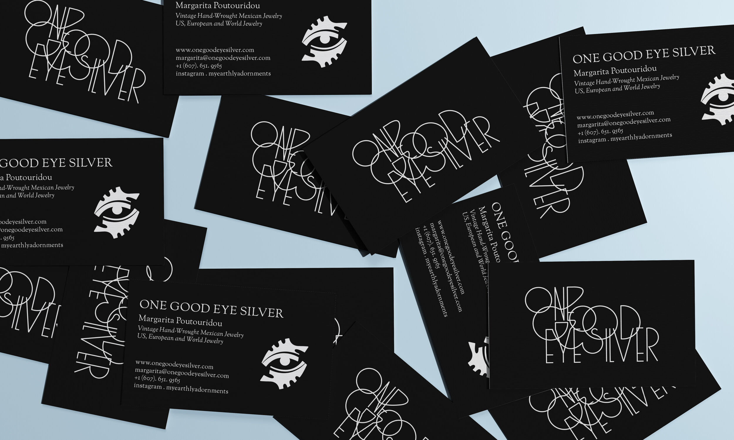

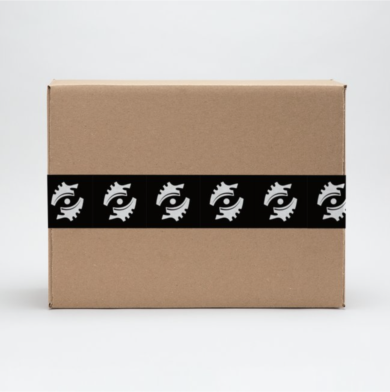

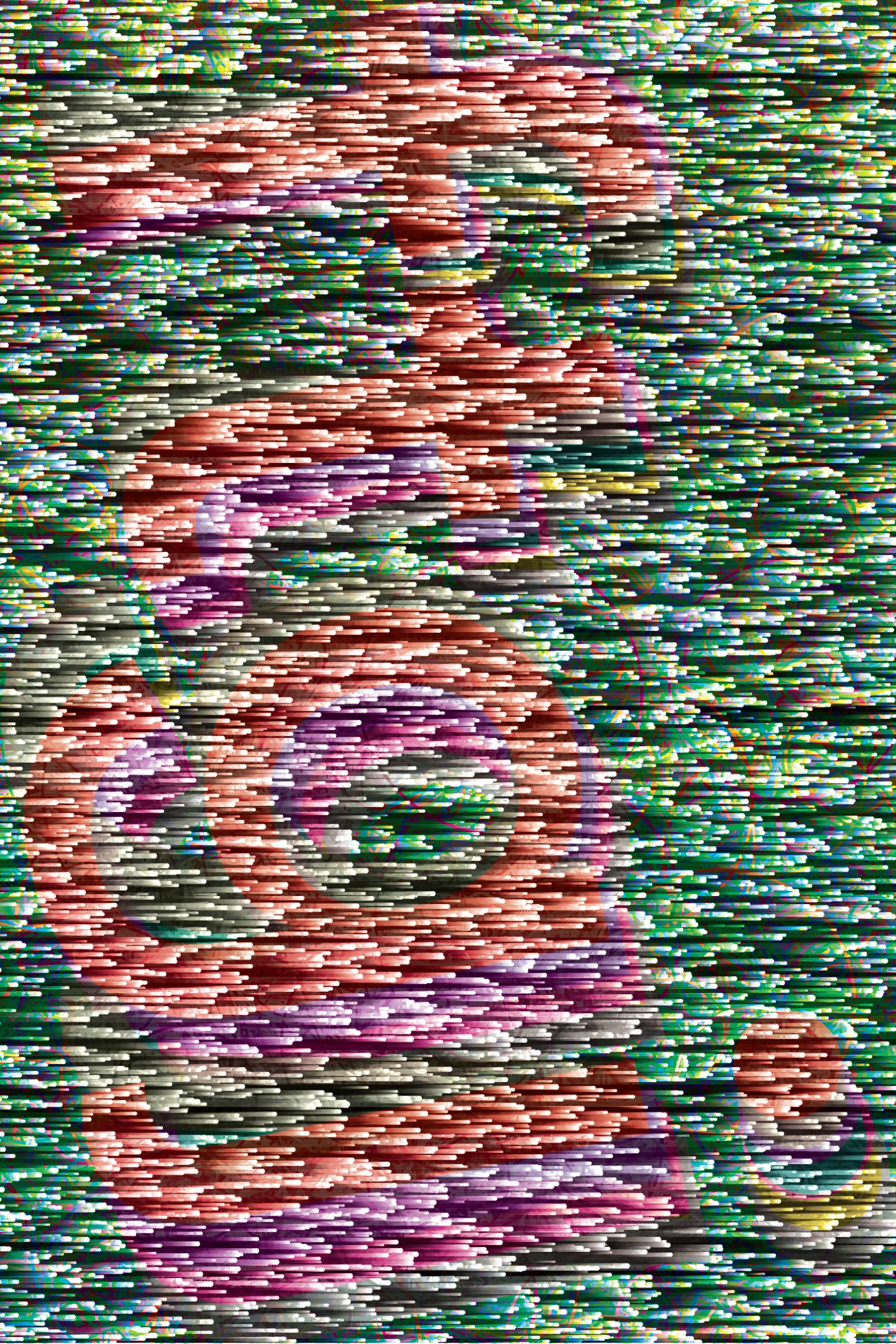
One Good Eye Silver, 2020
Brand identity / Logo design / Web design / Custom type / Print collateral
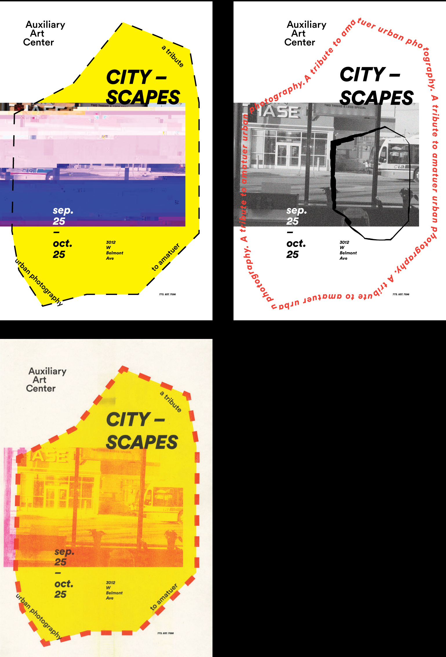
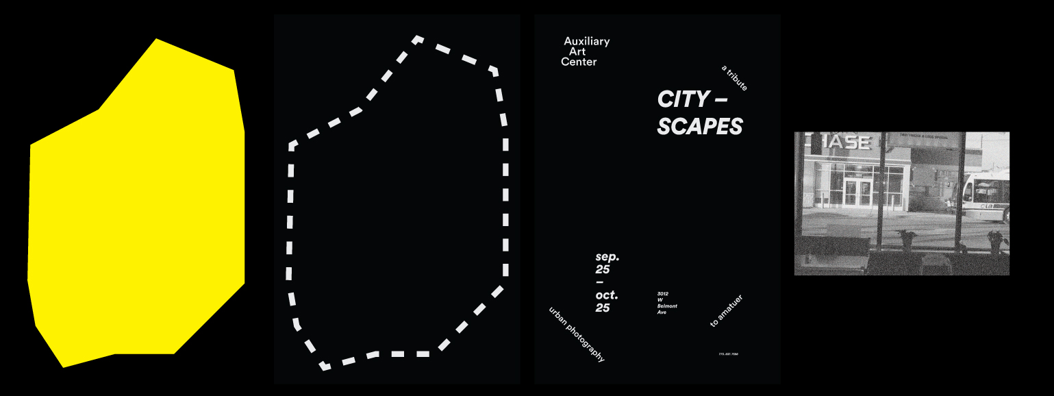
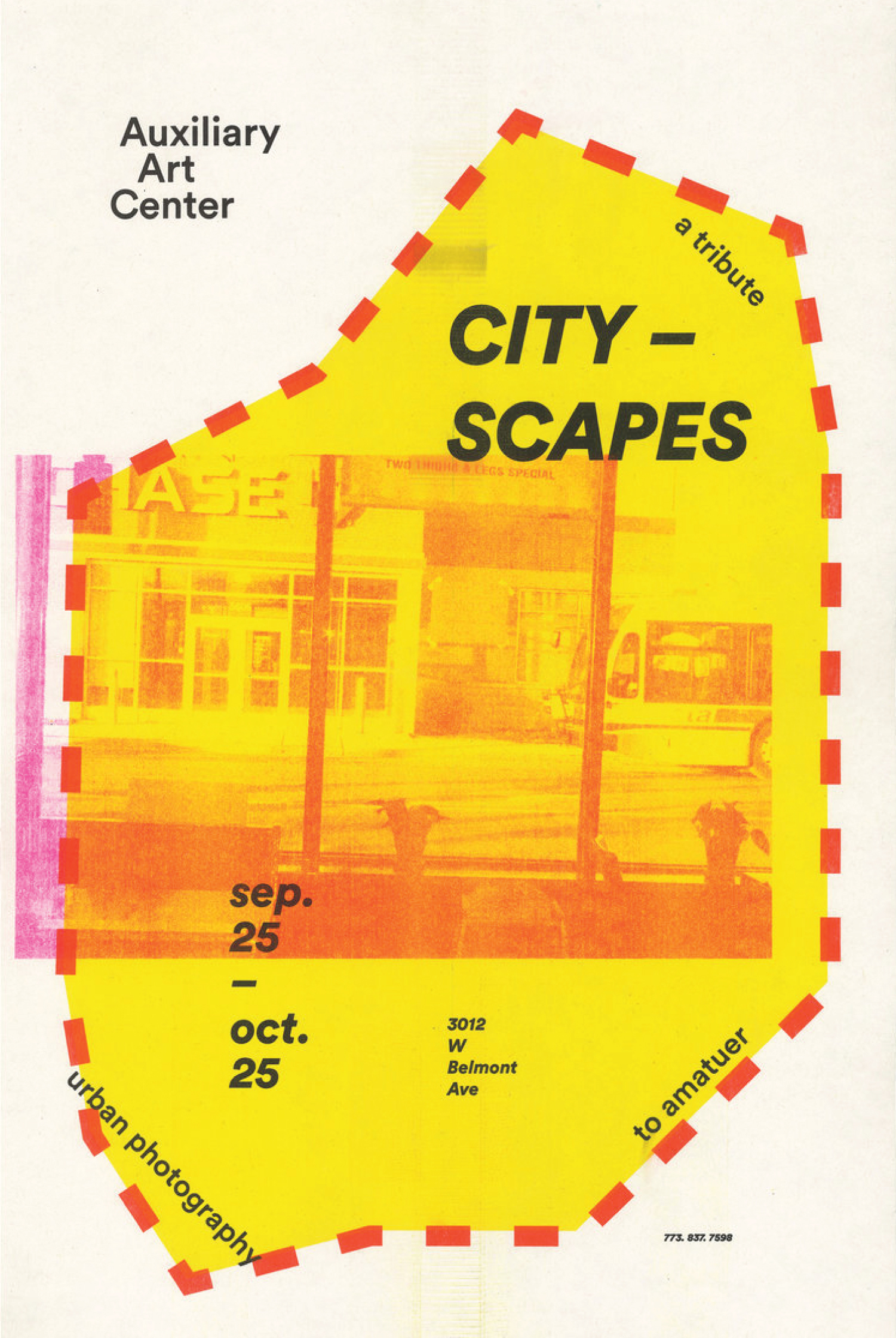
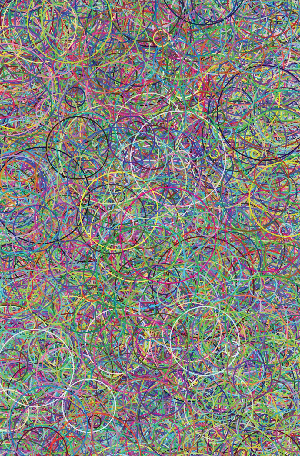
Cityscapes, 2017
Poster / risograph print / 4 screens
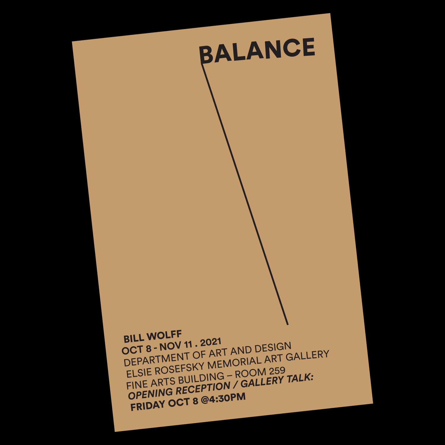
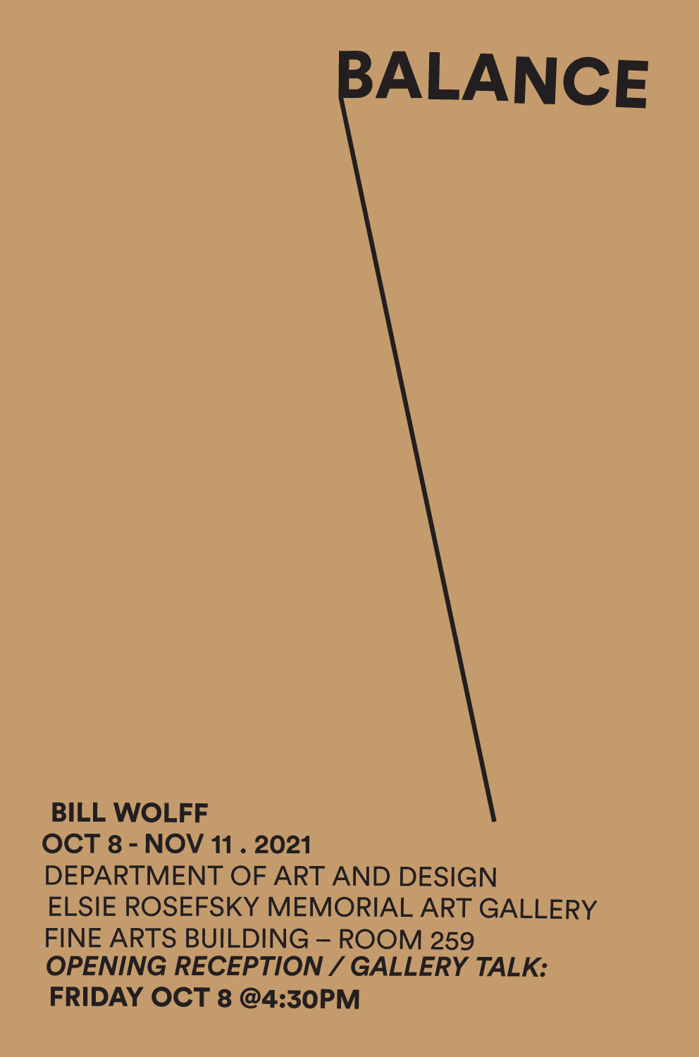
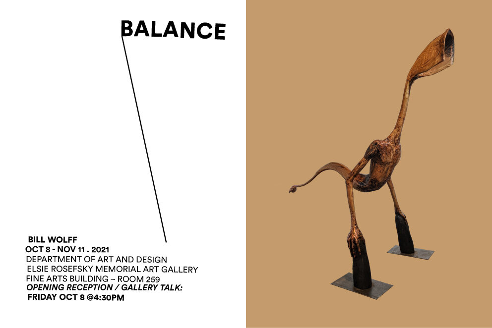
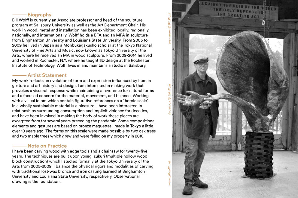
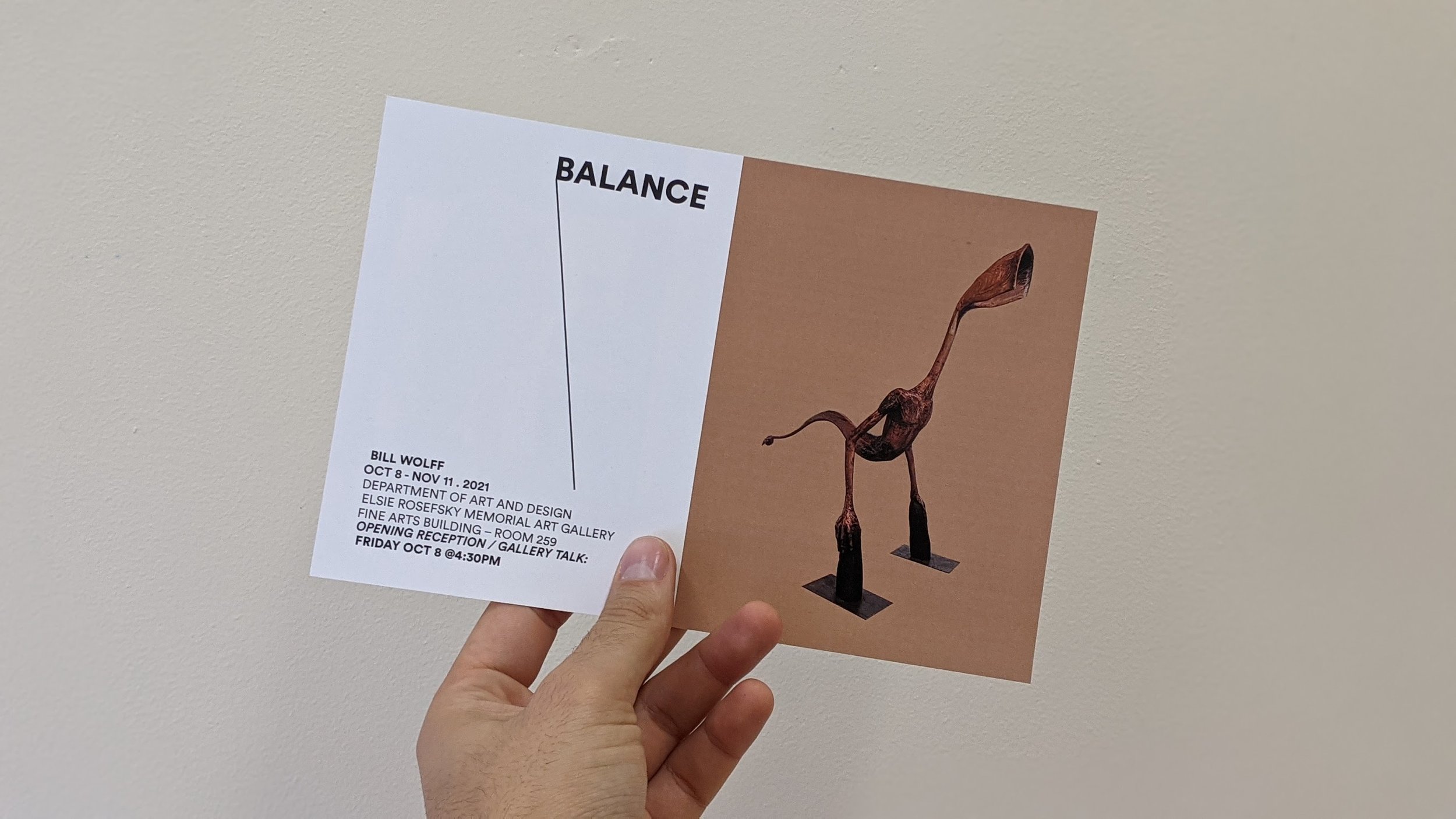
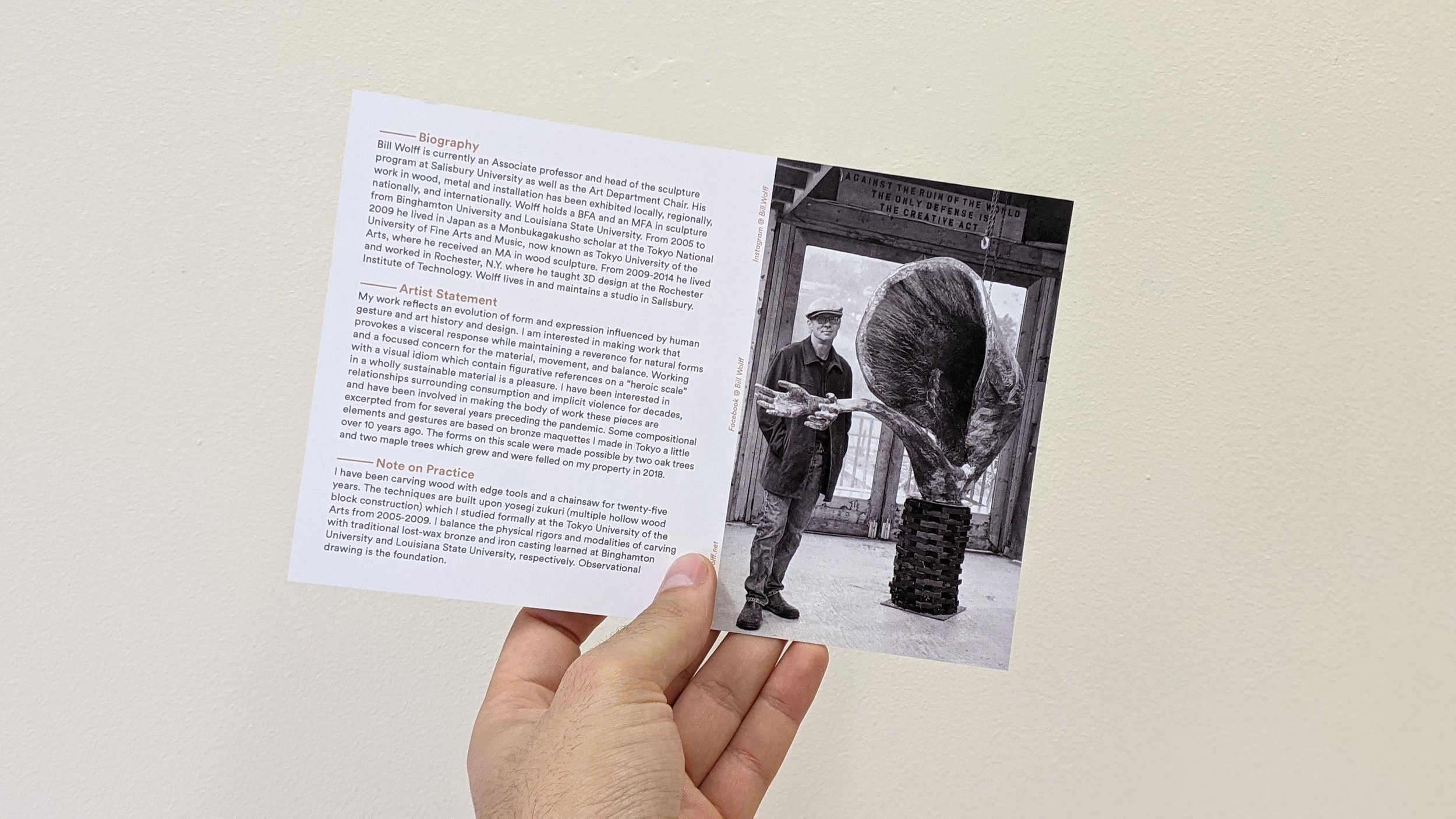
Balance — Bill Wolff (Binghamton University - Elsie B. Rosefksy Memorial Art Gallery, 2021
Poster / postcard / laser print